Ever met someone and instantly guessed what colour their lounge is? Probably not. But walk into a stranger's home, and one glance at their living room walls says a lot. Colour transforms a lounge, setting the tone, the mood, even how spacious it feels. So, with all the paint pots and Pinterest boards bubbling over, what is the most popular lounge colour right now? It's not just about trends—it's about how we want our lives to feel after the world flipped upside down a few years back. Let’s get right into the shades, the stats, and the science behind the colours people can’t stop painting on their lounge walls.
Why Lounge Colour Matters More Than You Think
Stroll down any UK high street and peek in the windows. You’ll spot endless lounge styles, but one thing’s obvious: colour reigns. According to a 2024 survey by Dulux, nearly 68% of Brits said picking the right colour for their living room stressed them out more than choosing new furniture. That’s not surprising, given how much we live in that one room—laughing, binge-watching, hosting, hiding from a wet Birmingham afternoon. A lounge is more than a space; it’s your own mood board. Colour affects how chilled or energised you feel, and it can make your room look twice as big, or half the size.
You can thank colour psychology for this obsession. Long before Instagram moodboards, researchers found that blue tones tend to calm nerves, while reds can crank up heart rates. Neutrals create a blank canvas, and green hints at growth and harmony. Recent data from Sherwin-Williams backs this up: over 72% of living rooms painted in 2023 featured some variation of warm neutral shades. These hues seem safe, but it goes deeper. After back-to-back lockdowns, people want to feel snug—not just on their sofas, but in their own heads.
Remember, your choice isn’t just visual. Colour subtly cues your habits. A deep navy wall might encourage endless reading sessions, while a bright white might make you dash outside. Even the paint finish counts: matt for softness, satin for light bounce, gloss if you need a pick-me-up. There’s a reason leading British designers—like Abigail Ahern—always say, ‘It’s not just the colour, but how it interacts with the light and life in your room.’ You paint your walls for yourself, but the right shade can charm anyone walking through your front door.
Want to feel more connected? Pick earthy greens. Need energy? Look at yellows or tangerine. Want to make a bold statement in a period property? You might go teal or rich purple, reflecting Victorian influences here in Birmingham. Still, trends shift as our lives do. The biggest surprise? Today’s most popular lounge colour isn’t the stark white of rental flats, or even the chilly greys dominating Instagram a few years ago. It’s something far warmer and more welcoming.
The Reigning Champion: Which Colour Tops the Lounges in 2025?
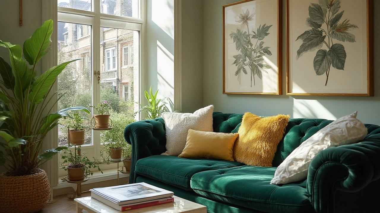
Right now, the most popular lounge colour in the UK is what designers call ‘greige’—a cosy blend of grey and beige (think Dulux's “Natural Hessian” or Farrow & Ball’s “Ammonite”). Homebase reported in their 2025 trends roundup that greige outsold any other paint shade for lounges by 18%. It’s not hard to see why. Greige acts like a blank canvas but feels less clinical than stark white and more modern than golden beige. It goes with nearly everything: bold blue velvet sofas, leafy houseplants, vintage armchairs, or Scandi shelving units. You can warm it up with rustic wood or cool it down with metallics. This flexibility is gold for folks who love switching up their accessories or experimenting with art.
Here’s the kicker—while muted grey reigns in city centre apartments, and navy has a loyal following, greige hits the sweet spot for both tradition and freshness. You’ll find it in listed Edwardian terraces and new-build semis alike. Just last spring, a poll by The English Home magazine found that 54% of respondents had either repainted their lounge greige or were planning to within the year. A national paint sales chart from Wickes showed that their best seller for 2024-25 was a shade called “Perfectly Toasted,” sitting squarely in the greige camp.
There’s another reason for greige’s runaway popularity—it works magic with lounge lighting. Our Birmingham gloom isn’t exactly Mediterranean, so colours that bounce and soften light win big. Greige adapts itself. North-facing room? Warmer greige avoids looking cold and shadowy. South-facing? It won’t get washed out by sun. You’ve likely seen it paired with blush or terracotta cushions, dark green plants trailing from mantlepieces, and black picture frames. It's the social chameleon of shades, never clashing, always complimenting.
If you’re painting over tired magnolia or icy blue, one coat of greige can instantly modernise your space. Trends a decade ago leaned on pure greys, but many found those chilly and stark. Greige dials it down, introducing a hint of warmth. Even celebrities are following suit—David Beckham was seen in a House & Garden tour last October gushing about his “cocoon-like living room painted in soft, earthy greige.”
| Colour | Percentage of Lounges (UK, 2025) | Mood Impact |
|---|---|---|
| Greige | 43% | Calm, Versatile |
| Soft Green | 18% | Relaxing, Restorative |
| Muted Grey | 16% | Modern, Cool |
| Deep Blue | 11% | Cosy, Dramatic |
| Classic Beige | 7% | Warm, Subtle |
| Other | 5% | Eclectic, Personal |
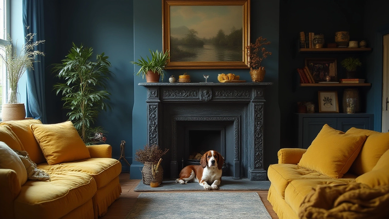
But what if you’re bored by this ‘safe’ shade? Don’t worry, design is rebounding with accent colours in emerald, burnt orange, and teal. It’s common to spot a mostly greige lounge with a punchy blue or mustard chair stealing the limelight. This is where colour blocking and statement walls come into play—especially for renters wary of painting a whole room. Pro designers often recommend testing samples on large card, taping them up, and checking them at different times of the day before committing. With paint, ‘buy slow, paint fast’ has become the unwritten rule.
Don’t forget ceilings! There’s a quiet movement in the UK towards painting ceilings a barely-there blush or creamy olive, which softens harsh lighting (think ‘Farrow & Ball’s “School House White’ up above). Lounges are moving away from the jarring contrast of white ceilings and coloured walls—a unified palette feels more shapely and calm.
Nailing Your Own Perfect Lounge Colour
Picking your lounge colour can feel like a commitment as big as choosing a new car or a holiday destination. Start by asking yourself: what do you want from your lounge? Cosiness? Light? A blank slate for bold art? Your reason should drive your choice. If you’re lost, think about what colours your wardrobe leans towards. People often feel at home surrounded by colours they wear the most.
Natural light is king. In Birmingham, we make do with less sun than the Cotswolds, so room orientation matters. North-facing rooms often suit warmer greiges or soft greens to keep things cheerful. South-facing spaces can handle deeper, cooler tones—navy or charcoal won’t suck the joy out of the daylight. For small lounges, lighter shades really do bounce light, opening up the space. Don’t go blindingly white, though—it can feel sterile on a dark winter’s day.
Practical tip: always swatch at least three shades, side by side, in patches bigger than your head. Watch them as the light shifts—from cloudy morning to golden hour. It’s mind-blowing how a colour you love at 10am becomes drab by 2pm. Another home hack: check the colour against your soft furnishings—what’s the point in the perfect paint if your beloved green velvet sofa suddenly clashes? And don’t be swayed by just the shade name. “Alpine Snow” might sound dreamy, but if it reads icy blue in your lounge at dusk, you’re stuck.
Cost can be a deal breaker too. Mid-range paint brands like Crown, Dulux, and Johnstone’s have massively improved their formulas to rival premium names. Many offer eco-friendly, low-VOC options for families or flats with dodgy ventilation. If you want to splash out, Farrow & Ball or Little Greene are the darlings of architects and interior magazines, but testers can save you a costly mistake.
Accent walls are back—not the 2011 feature wall that screamed “student let,” but elegant blocks behind shelves or fireplaces. If your lounge flows directly into an open kitchen or dining area, think about how colours merge. Consistent tones can unite these spaces, while a single contrasting wall can mark the lounge as ‘the snug.’
Don’t ignore trims and woodwork. Soft, off-white or muted green skirtings look more current than bright, stark whites. If you’ve got lovely original features (Birmingham is full of period cornices and fireplace surrounds), try a half-step darker or lighter tone on the mouldings. This highlights room character without any garish contrast.
For anyone renting or unsure about paint, peel-and-stick wall panels or oversized art rentals allow you to experiment with trends (everyone’s obsessed with gallery walls) without picking up a paintbrush. Plant life is the fail-safe accent. Lush Monstera, trailing Pothos, or feathery ferns warm up every lounge shade, especially the cool greiges and greys.
Got kids, pets, or a tendency to put feet on the wall (no judgement)? Opt for scrubbable emulsion. It’s not the sexiest advice, but high-traffic lounges need paint that lasts and wipes clean. Dulux Easycare or Valspar Premium Washable are safe bets for busy households.
Finally, remember: trends come and go, but your lounge is your retreat. Whether you go bold or play it safe with a soft greige, pick a shade you genuinely love. The most popular colour for a lounge in 2025 is greige—but the best colour is the one that makes you exhale after a long day and think, "Yeah, this feels like home." Life’s too short to live in a room painted for someone else’s Instagram feed.
Write a comment