Color Choice Guide: Pick the Perfect Hue for Rustic Furniture
Ever walked into a room and felt the colors just didn’t click? Choosing the right color for your rustic pieces doesn’t have to be a guessing game. With a few easy steps you can match wood tones, fabrics, and accessories so everything looks pulled together and still feels natural.
Start with the Room’s Light and Size
The first thing to check is how much light the space gets. Bright windows make dark colours feel cozy, while a dim room can look flat if you pick a shade that’s too light. Measure the square footage too – a small room can handle a deeper hue if you balance it with lighter walls, but a large open area can absorb a bold colour without feeling cramped.
Take a quick photo of the wall, the floor, and any existing furniture. Look at the undertones – do they lean warm (reds, oranges) or cool (blues, greys)? Your new colour should either echo those undertones or create a gentle contrast that still feels harmonious.
Pair Rustic Materials with the Right Colour
Rustic furniture often features reclaimed wood, raw metal, or woven rattan. Those natural textures already bring a lot of character, so you want a colour that highlights, not hides, the grain. For a light oak table, a soft sage or muted teal works well because the colour sits on the surface while the wood shows through.
If your piece is dark walnut, consider warm greys, creamy ivory, or even a dusty rose. The contrast makes the dark wood pop without clashing. When you’re dealing with leather or fabric upholstery, think about the fibre’s durability. Darker shades hide stains better, which is handy for high‑traffic sofas or chairs.
Don’t forget sustainability. Many of our customers choose low‑VOC paints or natural dyes that keep indoor air clean. Look for labels that say “eco‑friendly” or “zero‑VOCs”. These options give you the colour you love while staying true to a rustic, earth‑first ethos.
Before you commit, test the colour on a small piece of the furniture or on a poster board. Live with it for a day – watch how it changes from sunrise to sunset. If it feels right in both bright and low light, you’re probably on the right track.
Accent colours work wonders for adding personality. A muted mustard pillow, a teal throw, or a copper lamp can tie the main hue to the rest of the room. Use these pops sparingly – they should support the main colour, not overwhelm it.
Finally, think about maintenance. Light colours show dust quickly, while deep colours can fade if exposed to harsh sunlight. Choose a finish that matches your lifestyle: matte for a soft look, semi‑gloss for easy cleaning.
Here’s a quick checklist to keep handy:
- Check natural light and room size.
- Identify warm or cool undertones in existing décor.
- Match wood and material tones with complementary colours.
- Test with swatches for a full day.
- Add small accent pieces for contrast.
- Pick eco‑friendly paints or dyes.
- Consider durability and finish.
With these steps you’ll feel confident picking a colour that makes your rustic furniture shine. No more second‑guessing or mismatched rooms – just a space that feels warm, inviting, and uniquely yours.
Choosing the Best Color for Your TV Stand to Enhance Viewing Experience
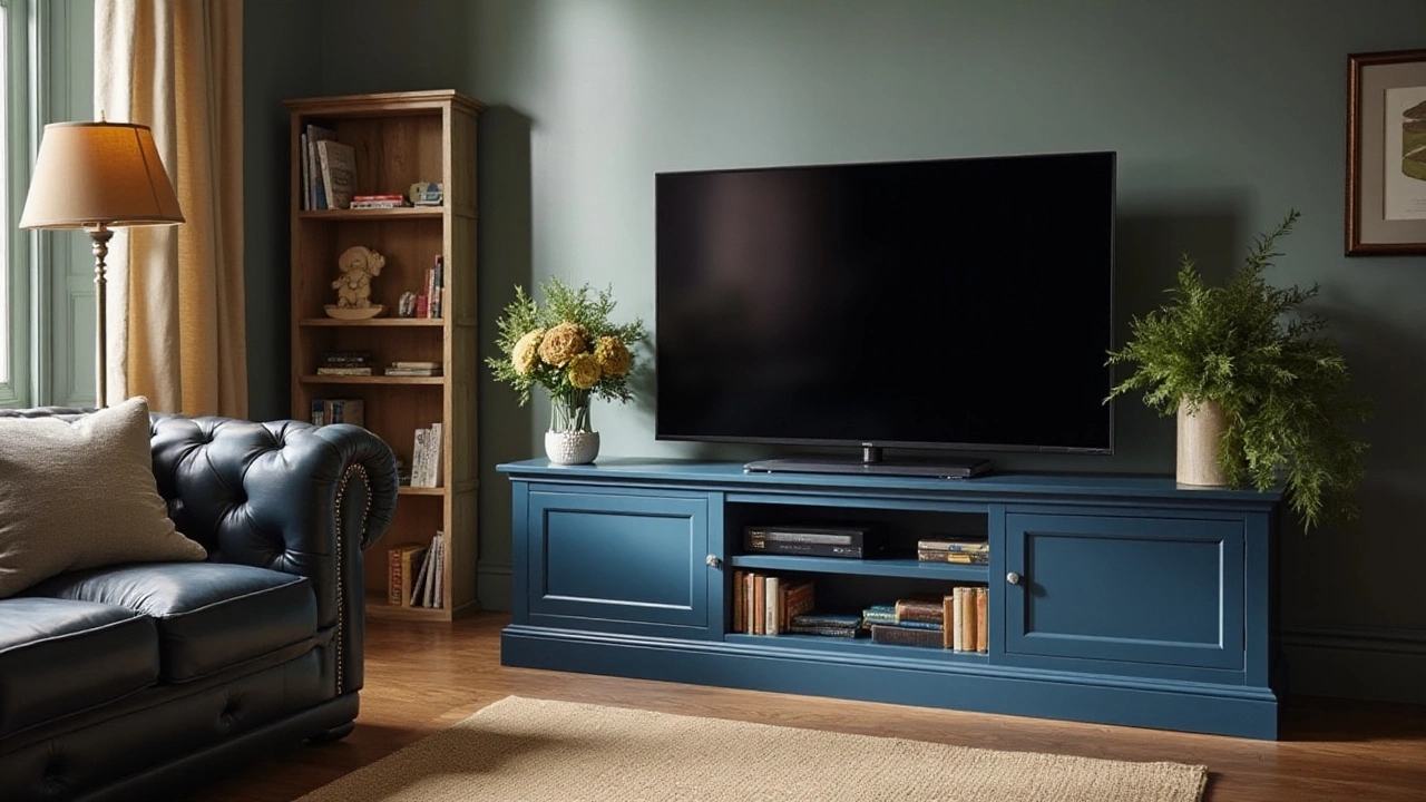
Selecting the right color for a TV stand can greatly enhance the aesthetic appeal of a room and improve your viewing experience. A well-chosen color complements your home's interior design and helps create a balanced look with your television setup. This article explores different color options for TV stands, providing tips on how to choose the perfect shade to match your living space. Discover the impact of color on mood and functionality, ultimately transforming your entertainment area into a stylish and harmonious environment.
More