TV Wall Color: How to Pick the Perfect Shade
When planning a home entertainment area, TV wall color, the hue applied to the wall behind your screen. Also known as backdrop shade, it sets the tone for both visual comfort and room aesthetics. TV size, the diagonal measurement of the screen, determines how far you sit and how much wall space you need plays a direct role in that choice, while room lighting, the mix of natural and artificial light in the space influences glare and color perception. Understanding these three entities helps you avoid a blinding screen or a dull backdrop.
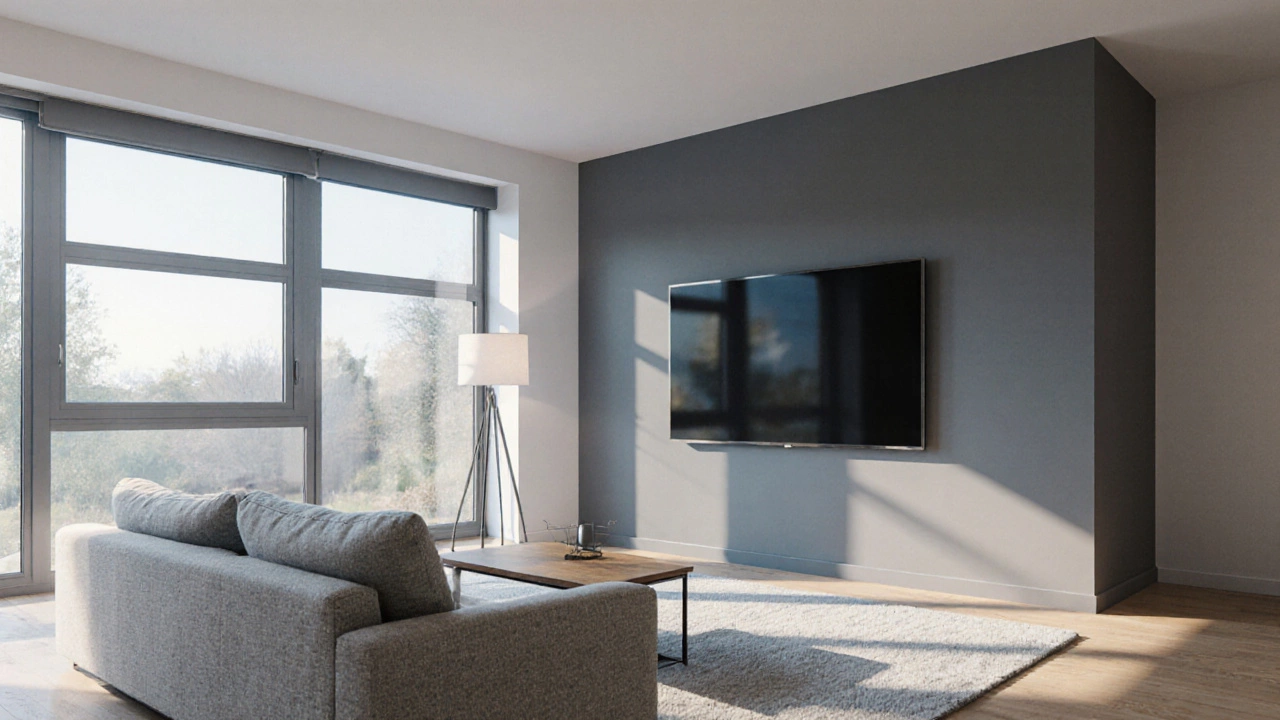
One key TV wall color lesson is that the shade should absorb or diffuse light, not reflect it directly into your eyes. Dark neutrals—charcoal, deep navy, or warm greys—reduce glare when you watch in a bright room, while softer tones like muted beige or pale sage keep the space feeling open. The choice also hinges on the wall paint, the specific paint finish and pigment used on the TV wall. Matte or eggshell finishes are preferred because they scatter light, preventing hot spots. Satin or semi‑gloss might look sleek but can bounce light back onto the screen, increasing eye strain. Pairing the right paint finish with a complementary color ensures the wall supports the viewing experience rather than fighting it.
Another important connection is between TV wall color and the viewing angle, the line of sight from your seating position to the screen center. If the wall color is too light, it can cause the screen to appear washed out, especially when you sit off‑center. A slightly darker backdrop keeps the picture contrast intact, making colors pop even when you’re not directly in front of the TV. This is why many designers recommend a color that’s one to two shades darker than the surrounding walls—a subtle shift that creates depth without shrinking the room.
Practical layout tips tie everything together. Measure your TV’s width and add at least a 4‑inch buffer on each side before picking paint colors; this buffer gives the eye breathing room and prevents the screen from feeling cramped. Next, evaluate the room’s primary light sources. If you have large windows that let in strong daylight, opt for a cooler, darker tone that balances the influx. Conversely, in a dimly lit room, a warmer, mid‑tone hue can add vitality without overwhelming the picture. Finally, test paint samples on a large swatch of the wall, view the TV for a few minutes at different times of day, and note any glare or color shift.
What You’ll Find Next
The articles below dive deeper into related topics: sizing the perfect TV stand for a 65‑inch screen, calculating ideal viewing height, and choosing neutral furniture colors that match any décor. Together, they give you a full toolbox for creating a cohesive, comfortable media zone where the wall color, furniture, and tech all work in harmony.
Dark vs Light TV Wall: Which Color Works Best?
Discover how dark or light TV wall colors affect glare, mood, and room size, plus a step‑by‑step guide, checklist, and FAQs to help you choose the perfect shade.
More