Wall Paint Matching Made Easy: Choose the Right Colour Every Time
Staring at a paint can and wondering if it will look right on your wall is normal. The good news? You don’t need an interior designer to get it right. With a few simple steps you can match paint to your furniture, lighting and vibe, and avoid the dreaded “wrong colour” regret.
Basics of Matching Paint to Your Space
Start with the colour wheel. Complementary colours—those opposite each other—create drama (think navy and orange). Analogous colours sit next to each other and give a calm, coordinated feel (soft greens with muted yellows). If you prefer a safe route, stick to neutrals like greys, beiges or off‑whites and let furniture do the talking.
Lighting changes everything. Natural light in a south‑facing room will brighten a colour, while north‑facing rooms keep tones cooler. In the evenings, under warm LED bulbs, a deep teal can feel cosy; under cool fluorescent lights the same shade may look stark. Test a small swatch at different times of day before you commit.
Consider the room’s purpose. A bedroom benefits from soothing tones—pale blues, muted lavenders or soft greys. A kitchen can handle energetic hues like sunny yellow or fresh mint. Living rooms are flexible; you can pull a bold accent wall and keep the rest neutral for balance.
Practical Steps to Test and Pick the Right Shade
1. Grab sample pots. Most UK paint retailers sell 50 ml testers. Paint a 1 ft square on the wall where the colour will be most visible.
2. Live with it. Leave the swatch up for at least 48 hours. Watch it in morning sunshine, afternoon glare and evening lighting. If the colour shifts dramatically, it may not be the right fit.
3. Match to furniture. Hold a piece of your sofa, rug or artwork up to the painted area. If the paint complements rather than clashes, you’re on the right track. Remember, dark furniture can ground a light wall, while light pieces can lift a deep shade.
4. Use the 60‑30‑10 rule. Choose a dominant wall colour (60 %), a secondary colour for accents like cushions or curtains (30 %), and a small pop of contrast (10 %). This keeps the room balanced and avoids colour overload.
5. Don’t ignore texture. Rough plaster or brick will absorb paint differently than smooth drywall. Rough surfaces can mute vibrant shades, so you might need a richer hue to achieve the same look.
6. Plan for the future. If you like to switch décor often, pick a base colour that works with many styles—think warm greys or soft taupes. Then change accents as seasons change.
Finally, keep a paint journal. Jot down the brand, name, finish (matte, satin, eggshell) and the lighting conditions when you tested it. A quick note will save you time if you ever need to touch up or repaint.
Matching wall paint isn’t rocket science—just a bit of observation and a few tests. Follow these steps, trust your eyes, and enjoy a room that feels right every time you walk in.
Should Your Built‑in Bookcase Match the Wall Color? A Practical Guide
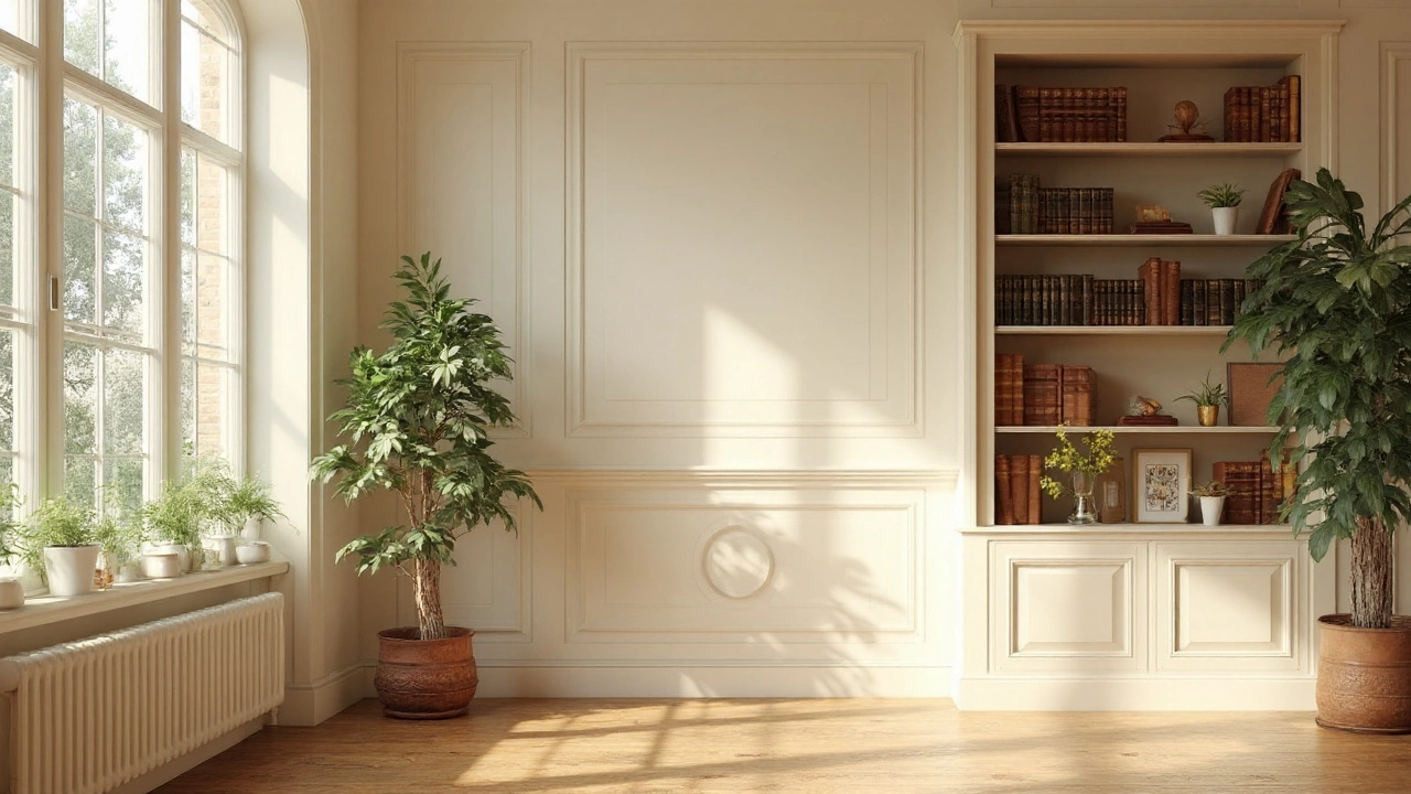
Discover when to paint a built‑in bookcase the same hue as your walls, how contrast works, and tips for achieving a balanced look in any room.
More