Neutral Color Selector
Your Room Profile
Color Recommendations
Select your room characteristics and click 'Find My Perfect Neutral' to see your recommendations
Key Takeaways
- White, beige, gray, charcoal, taupe, nude, and soft pastels are the go‑to hues that pair with every style.
- Choose a shade based on room size, lighting, and the mood you want to create.
- Mix neutrals with bold accessories for a layered, lived‑in look.
- Durability matters - darker neutrals hide wear better, while light tones need more upkeep.
- Use the comparison table to match a color to your specific needs.
Ever stare at a showroom and wonder which furniture colour will never look dated? The answer is simpler than you think: neutral furniture colors. They blend with everything from industrial lofts to cottage‑style living rooms, making redesigns painless and budget‑friendly. Below you’ll learn the exact shades that work anywhere, how to pick the right one for your space, and mistakes to dodge.
Why neutral colours are the safest bet
Neutral tones sit in the visual middle ground - they don’t compete with patterns, artwork, or bold accent pieces. Because they reflect rather than absorb light, they can open up cramped rooms or add warmth to large, echo‑y spaces. From a resale perspective, homes staged with neutrals sell faster and often at a premium, a fact confirmed by a 2023 UK property‑market report that listed neutral‑styled rooms as a top buyer draw.
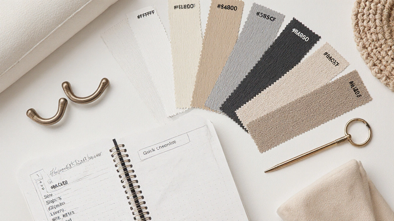
Top 7 neutral shades that match anything
Each colour below is defined once with schema markup; later mentions are plain text.
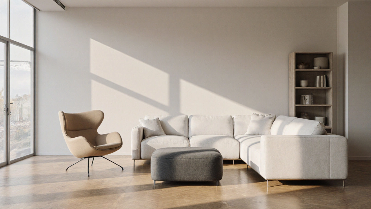
White is a clean, bright hue that reflects maximum natural light and creates a sense of spaciousness. Use it on sofas, cabinets, or entire wall units when you want a fresh, airy vibe. Pair with wood grain or matte black hardware for contrast.
Beige is a warm, sandy tone that adds subtle depth without overwhelming the eye. Ideal for family rooms where kids and pets may cause wear - the colour disguises small scuffs.
Gray is a versatile mid‑tone that works well with both warm and cool colour palettes. Choose a light gray for a modern minimalist look or a medium gray for a more grounded feel.
Charcoal is a deep, almost‑black gray that adds drama while still being neutral. It’s perfect for accent chairs or a statement coffee table that won’t clash with colourful cushions.
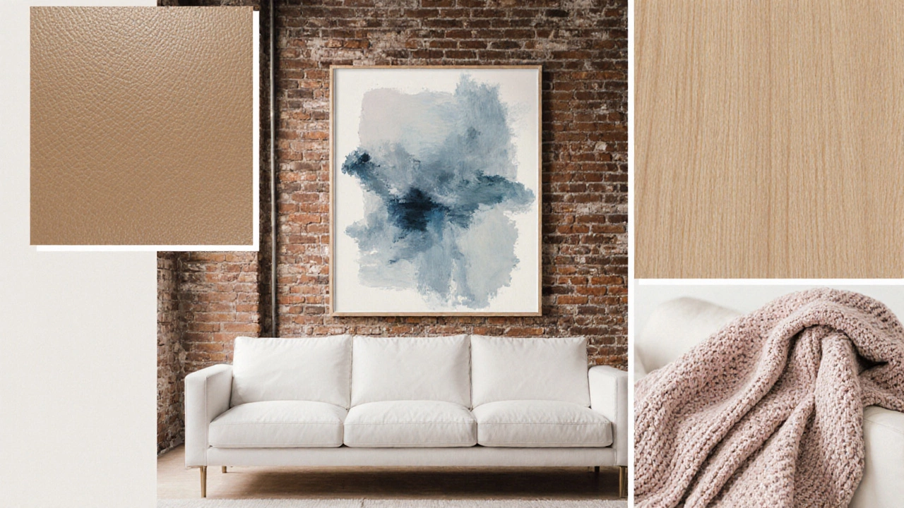
Taupe is a blend of gray and brown that offers a sophisticated, earthy backdrop. Use taupe on larger pieces like wardrobes to create a timeless feel.
Nude is a soft, skin‑tone inspired hue that adds a gentle warmth to any room. It works especially well in bedrooms where you want a calm, soothing environment.
Soft pastel is a muted, low‑saturation colour such as blush pink or mint green that remains neutral enough to pair with bold accents. Pastel furniture can act as a subtle statement without dominating the space.
How to choose the right shade for your space
- Assess natural light. Bright rooms tolerate cooler whites and light grays; dim rooms benefit from warmer beige or nude.
- Consider room size. Darker neutrals like charcoal can make a large room feel cozier, while light shades enlarge a tiny area.
- Think about existing décor. If you already own patterned rugs or colourful art, pick a neutral that complements the dominant hue in those pieces.
- Match your lifestyle. Families with kids often favour beige or taupe because they hide stains better than stark white.
- Sample before you buy. Paint swatches on large poster board and view them at different times of day to see true colour shifts.
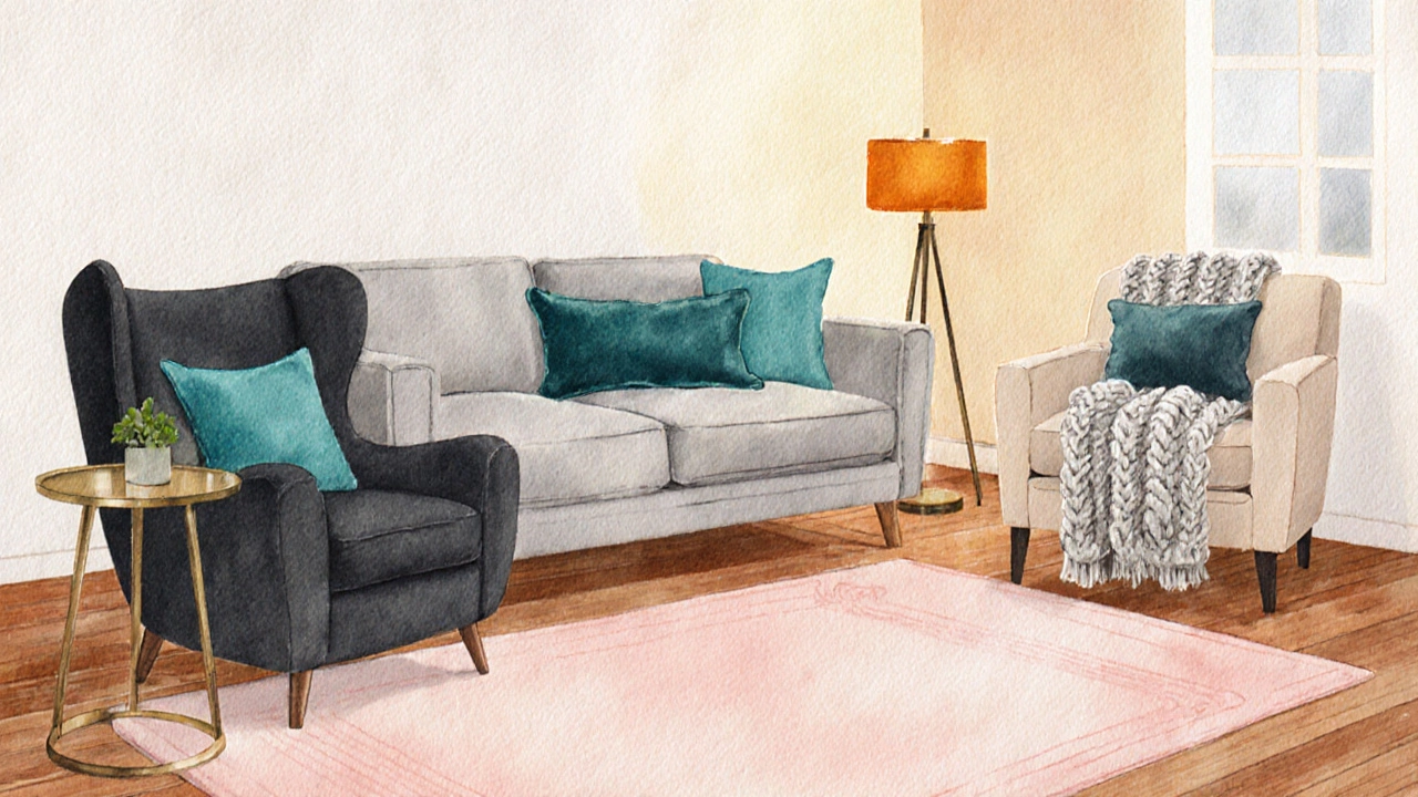
Mixing neutrals with bold accents
Neutrals provide a blank canvas. Add interest by introducing:
- Colourful throw pillows - a pop of teal on a gray sofa feels intentional.
- Metallic hardware - brushed gold on a white dresser adds luxe without clashing.
- Texture layers - a chunky knit blanket on a beige sofa creates depth.
- Statement art - a large abstract piece can become the room’s focal point while the furniture stays understated.
Durability and maintenance guide
Different neutrals hide wear differently. Here’s a quick rule‑of‑thumb:
| Light colours (white, pastel) | Show scratches and spills quickly - use washable slipcovers. |
| Medium tones (beige, gray, taupe) | Balance aesthetics and practicality - ideal for everyday use. |
| Dark tones (charcoal, nude) | Best at camouflaging wear - perfect for high‑traffic areas. |
Regardless of shade, treat leather with conditioner, wood with a protective finish, and upholstery with a fabric protector spray.
Comparison Table
| Colour | Hex Code | Mood / Vibe | Best‑Fit Rooms | Wear Hides Well? |
|---|---|---|---|---|
| White | #FFFFFF | Fresh, airy | Living rooms, kitchens | No |
| Beige | #F5F5DC | Warm, inviting | Family rooms, bedrooms | Yes |
| Gray | #808080 | Modern, balanced | Offices, lofts | Medium |
| Charcoal | #36454F | Bold, sophisticated | Large living areas, media rooms | Great |
| Taupe | #483C32 | Earthy, elegant | Bedrooms, studies | Medium |
| Nude | #C8AD7F | Calm, soothing | Bedrooms, nurseries | Good |
| Soft Pastel | #FADADD (blush) | Gentle, whimsical | Child’s room, boutique cafes | Low |
Common pitfalls to avoid
- Choosing a single shade for the entire house. A subtle change in undertone between rooms adds visual interest.
- Ignoring lighting. A colour that looks perfect under showroom lights may turn dull under natural daylight.
- Over‑matching. Pair neutrals with at least one contrasting element - texture, pattern, or colour - to prevent a flat look.
- Skipping samples. Paint chips on a wall, not a swatch on a brochure, reveal true colour interaction.
Quick checklist before you buy
- Measured room dimensions and lighting sources.
- Selected primary neutral shade that suits the mood.
- Identified accent pieces (pillows, art, rugs).
- Checked durability rating for the material.
- Ordered a small fabric/finish sample.
Frequently Asked Questions
Will white furniture look dirty quickly?
Yes, white shows dust, spills, and scratches more readily than darker tones. Use washable slipcovers or opt for a matte finish that hides minor marks.
Is gray too cold for a cozy living room?
Gray can feel cold if paired with harsh lighting and sharp angles. Warm up the space with wooden accessories, soft textiles, and warm‑tone lighting.
Can I mix two neutral colours in one piece of furniture?
Sure - many manufacturers offer two‑tone upholstery (e.g., beige base with gray stitching). This adds subtle depth while staying neutral.
What finish should I choose for durability?
For wood, a matte polyurethane protects against scratches while keeping the colour true. For leather, a water‑resistant topcoat helps the surface stay fresh.
Do pastel furniture pieces clash with modern décor?
Not at all. Soft pastels act as a muted colour that can tone down bold metal frames or geometric shapes, creating a balanced modern‑retro mix.
Write a comment