Ever stared at a cramped room and wondered if a little paint could work some magic? Most folks think gray will shrink a space, but the right shade actually does wonders. There’s a science to shade, believe it or not. Color experts have been harping on about how lighter tones bounce light and make rooms open up visually. It’s subtle, but trust me, once you see the difference, there’s no going back.
How Light Gray Changes Room Perception
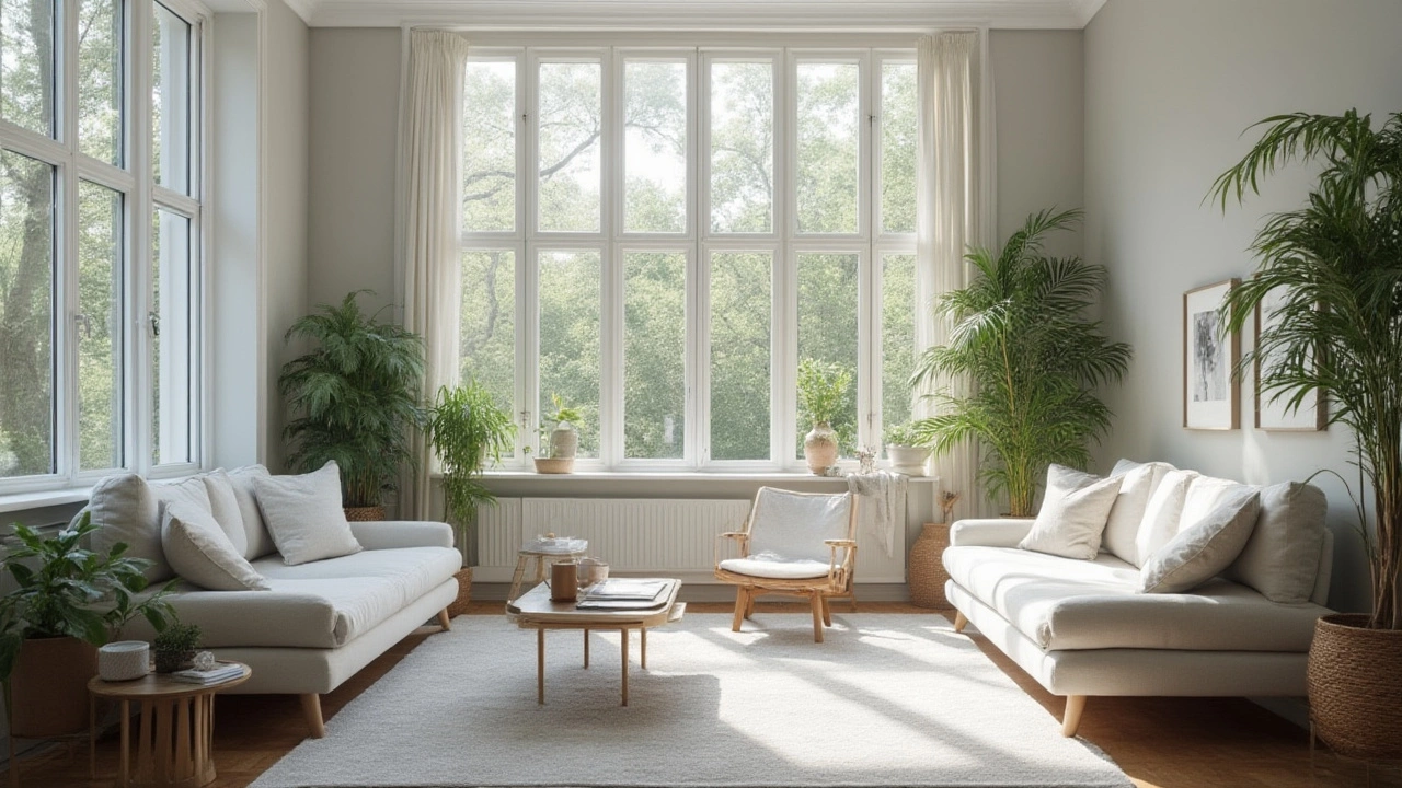
Let’s get straight to the heart of it. When people talk about making a room look bigger, they’re almost always talking about tricking the eye. Light, especially natural light, is your secret weapon here. The lighter your walls, the more light they bounce around. Dark grays can look slick, but they gobble up light and cozy the walls in way too much for small spots. A shade like Benjamin Moore's ‘Classic Gray’ or Sherwin Williams’ ‘Agreeable Gray’ are among interior designers’ favorites. They aren’t chalky or cold—just that perfect soft hit of color. These shades offer a warm undertone that keeps the vibe welcoming, not clinical, which is a big deal when you’re actually living in the space and not browsing Pinterest photos.
People love putting these light grays to the test in spaces like apartments in New York, where every square foot is a battle. Consistently, “Classic Gray” (OC-23) stands out for opening up rooms. If painting your whole place this color seems boring, pros suggest painting just the largest wall or the ceiling in a matching or slightly lighter gray. This draws the eye up and outward, making ceilings seem taller and walls recede a bit. It’s clever and surprisingly effective.
Gray’s ability to make a space look bigger depends on the undertone as well. Blue undertones can make a room feel fresh but icy. Yellow undertones are usually better for warmth—like the famous Farrow & Ball ‘Ammonite’. Here’s a quick stat: In a 2022 survey by Apartment Therapy, 72% of renters who painted their walls a soft, warm gray reported their rooms “felt noticeably bigger.” Best gray paint choices almost always lean to the lighter and warmer family for these results.
But what about actual numbers and science? Check this out:
| Gray Paint Color | Light Reflectance Value (LRV) | Warm/Cool Undertone |
|---|---|---|
| Benjamin Moore Classic Gray (OC-23) | 74 | Warm |
| Sherwin Williams Agreeable Gray (SW 7029) | 60 | Warm |
| Farrow & Ball Ammonite | 77 | Warm |
| Sherwin Williams Repose Gray (SW 7015) | 58 | Cool |
For comparison, flat white has an LRV near 90-95—the higher the number, the more light is reflected. So, grays above 60 are fantastic if you want to create an airy feel and visually expand the room without it feeling too stark.
Gray Shades That Expand Your Space
So, which grays are magic for making a small spot look bigger? As anyone who’s scrolled through endless paint swatches knows, there’s no single answer. But there are a few shades that designers agree on almost every time. A light gray with a hint of warmth—think Benjamin Moore’s ‘Paper White’ or Behr’s ‘Silver Drop’—keeps things bright while avoiding sterile or cold vibes. You want a color that shifts in the light: a chameleon gray that picks up blues on sunny days, beige when the lights turn on.
Design pros suggest these approaches to picking the best gray:
- Look for high LRV (above 60): This tells you the paint will reflect light well. Your room gets a brighter, more open feel.
- Consider undertone: Slight beige or taupe undertones make a space feel bigger and more welcoming. Blue or green undertones look crisp but can cool things down too much.
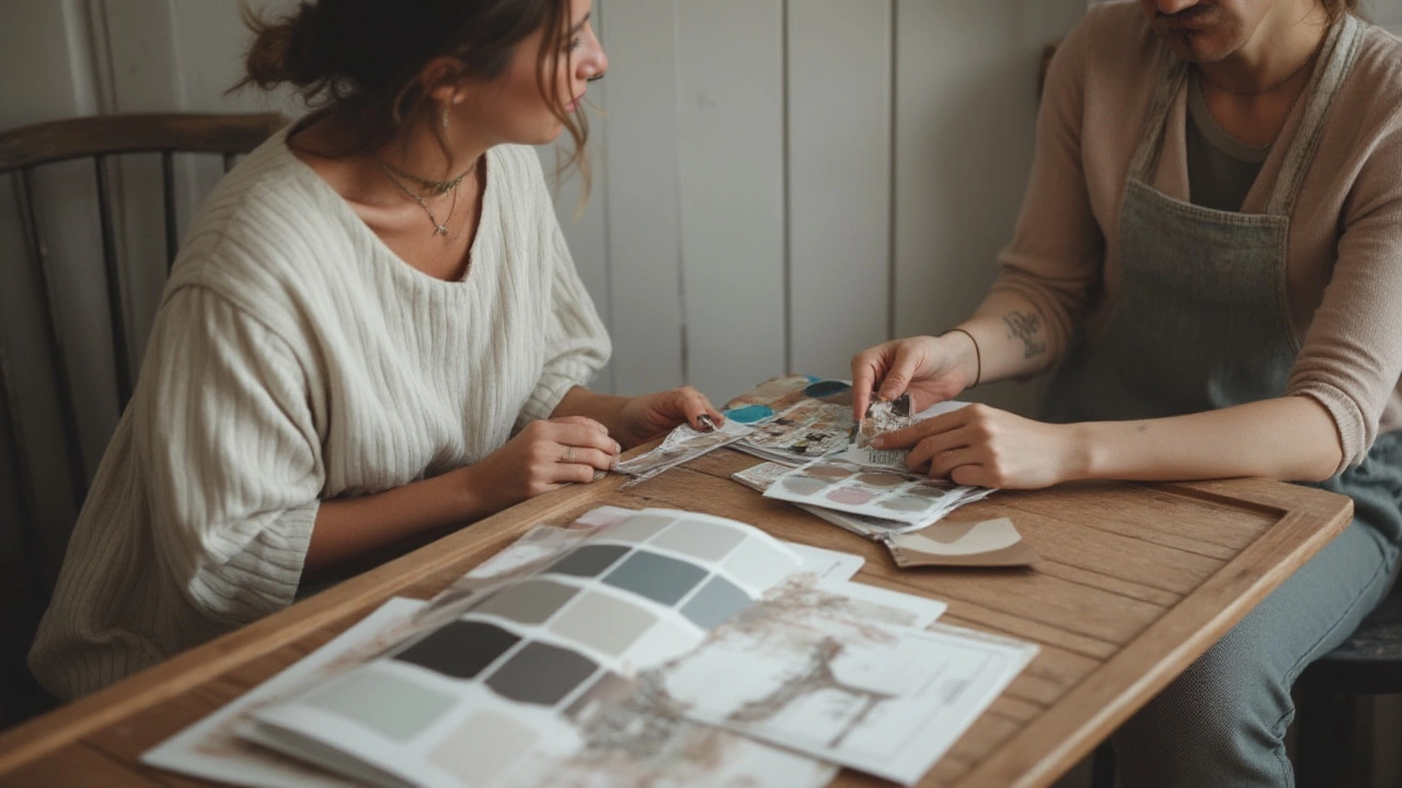
- Test it out: Paint big swatches and check at different times of day. Grays can change with daylight and lamp light—what looks soft at noon can feel drab once the sun sets.
- Try one color on all trims: If you paint baseboards and even the ceiling in the same light gray, the room loses visual “stops”, appearing seamless and more expansive.
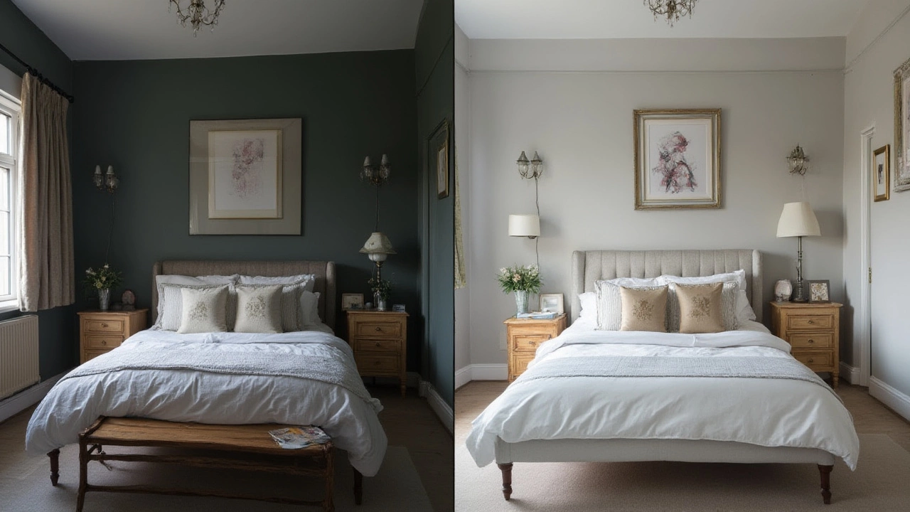
One trick I’ve seen in action: paint the walls in a very light gray (“Classic Gray” is a staple here), then paint the ceiling the lightest version on the color card, or even pure white. This makes the room soar. If you have crown molding or wainscoting, painting those in the same gray as the wall erases hard lines—again, it’s all about the eye traveling without a jolt.
And don’t ignore your light bulbs! Soft white (2700-3000K) LEDs add just enough warmth for grays to stay inviting. Cool white bulbs can make even the friendliest gray seem like it belongs in a hospital. I know this sounds minor, but honestly, it’s a game changer and costs way less than buying new furniture.
Here are some proven shades for expanding space:
- Benjamin Moore Classic Gray (OC-23)
- Sherwin Williams Agreeable Gray (SW 7029)
- Behr Silver Drop (790C-2)
- Farrow & Ball Ammonite
- Sherwin Williams Repose Gray (SW 7015) for slightly cooler undertones
You also don’t have to stick to one flat finish. Try eggshell or satin. Higher sheen reflects more light and amplifies the widening effect, especially in living rooms and bedrooms.
How to Use Light Gray for Maximum Impact
Picking the right shade is only half the job. Placement is everything. A ton of folks paint all four walls and call it a day. If you’re ambitious, try this: paint the farthest wall in the lightest gray and keep adjacent walls slightly deeper. This stretches the space and pulls the eye across the room—kind of how a horizon pulls you forward.
Ever heard of the ‘5th wall’? That’s your ceiling. Ditch builder-grade white and use the color above. It ties together any odd angles or sloping ceilings, minimizing visual clutter. Even kitchens and bathrooms can benefit—a light gray wall behind your vanity or cabinets makes those fixtures pop, while creating breath between elements.
Now, maybe you’re worrying about coolness in a north-facing room. North light is blue and tends to “chill out” all colors. To warm things up, mix in soft neutrals. Add wood tones to floors and furniture, or warmer metals like brass and bronze. This balances out the airy feel so it’s not icy. Place mirrors opposite a window to amplify light, bouncing those high-LRV gray walls into every corner.
Color psychology research backs this up. In 2021, a University of Minnesota study found that rooms painted in warm, light neutrals scored higher for perceived spaciousness—even more than stark whites. People in these spaces reported less stress, too. The paint you choose actually changes your mood and how you use a room. Too dark, and people tend to avoid the space; too cold, and it doesn’t feel inviting.
Now, accent pieces matter, too. Pairing light gray walls with white, glass, or mirrored furniture eliminates visual blockages. Keep curtains and rugs in similar tones—the space flows without interruption. You don’t have to stick to gray everything, though. Pops of soft blue, green, or natural wood nod to warmth and personality, while still letting the light gray do its magic.
One last tip: Don’t forget about clutter. A small room painted in the right gray immediately looks bigger, but if every surface is filled with stuff, you’ll lose the illusion. Stash away what you can, and let the paint and natural light do their thing. You’ll step back, look at your handiwork, and honestly wonder how you ever lived with anything else.
Write a comment