ADHD Calming Colors: Pick the Right Hues for Focus and Comfort
If you or a loved one has ADHD, the visual environment can make a big difference. Bright, chaotic colours may increase distraction, while softer, soothing shades can calm the mind and help maintain attention. Below are practical ideas for choosing calming colours in each room, plus quick ways to test a colour before you commit.
Why Colour Matters for ADHD
Research shows that certain wavelengths affect brain activity. Cool blues and muted greens tend to lower heart rate and reduce mental clutter, making it easier to stay on task. Warm neutrals like soft beige or warm gray give a sense of stability without overstimulating the senses. By layering these colours, you create a backdrop that supports concentration rather than pulling it away.
Room‑by‑Room Colour Guide
Living room: Paint one wall in a pale teal or sage green and keep the rest in a light neutral. Add a plush rug in a muted mustard or dusty rose for a subtle pop that doesn’t scream for attention. Choose slipcovers in natural fabrics that match the wall colour, so the whole space feels cohesive.
Home office or study: Go for a soft blue or lavender on the walls. These shades are known to promote calm and improve focus. Pair the paint with a white desk and a chair in a muted navy to keep the palette consistent. If you need a visual cue for breaks, place a small plant in a pastel pot on the desk – the green adds life without distraction.
Bedroom: Light greys with a hint of blue work well for sleep‑friendly spaces. Avoid harsh reds or bright oranges, which can keep the brain wired. Use darker bedding in a gentle charcoal to create depth, but keep night‑stand lamps in warm white light to avoid harsh contrasts.
Kids’ rooms: Kids with ADHD benefit from a balance of calm and playful. Paint a ceiling in a very light sky‑blue, then keep walls in a gentle cream. Add colourful storage bins in pastel shades for a splash of fun that stays organized.
Before you paint a whole room, test a sample patch about three feet high. Live in that space for a day and notice how your focus feels. If the colour feels too flat, add texture – a woven throw or a textured wall panel can introduce interest without adding visual noise.
Remember, it’s not just paint. Furniture upholstery, curtains, and even floor tiles contribute to the overall palette. Stick to the same colour family for all soft furnishings to keep the environment harmonious.
Finally, keep lighting in mind. Natural light enhances calming colours, while harsh fluorescent bulbs can make even the softest hue feel harsh. Use warm LED bulbs (around 2700‑3000K) to maintain the soothing effect after sunset.
Choosing ADHD calming colors doesn’t have to be a massive project. Start with one wall, one piece of furniture, or even a single rug and watch how the space feels. Small, intentional changes add up, creating a home that supports focus and reduces stress.
Best Calming Colors for Office Chairs for Individuals with ADHD
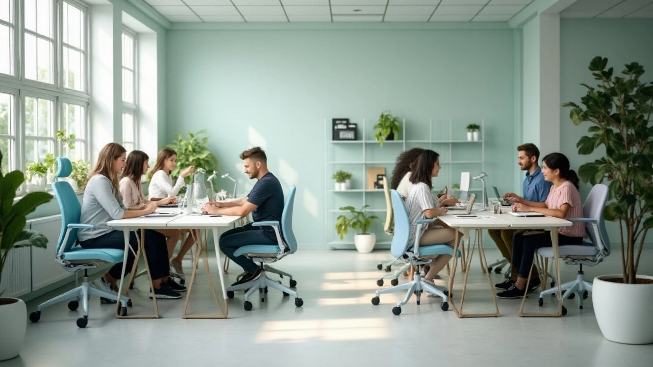
Discover how selecting the right color for office chairs can create a calming workspace for individuals with ADHD. Different hues impact concentration, mood, and productivity in unique ways. Explore which shades are known for their soothing effects, drawing on insights from color psychology. Utilize these tips to design an environment that enhances focus and appeases restlessness. Learn how to transform a chaotic space into a serene haven through thoughtful color choices.
More