Color Psychology: Using Hue to Shape Your Home’s Mood
Ever wonder why a blue sofa feels calming while a red armchair pumps you up? That’s color psychology at work – the way colors trigger feelings and behavior. When you pick paint, cushions, or curtains, you’re actually setting the atmosphere for the whole room.
What Each Main Color Does
Blue is known for soothing nerves. It works great in bedrooms or study corners where you need focus or relaxation. Green brings a touch of nature; it’s easy on the eyes and can make a living room feel fresh. Yellow adds energy and optimism, perfect for a kitchen island or a sunny reading nook. Red sparks excitement and appetite, so a red accent wall in a dining area can boost conversation. Soft neutrals like beige or gray act as a calm backdrop, letting your bold pieces stand out without overwhelming the space.
Practical Tips for a Balanced Look
Start with a base color you love, then add smaller pops of complementary hues. If you choose a deep navy sofa, throw in mustard cushions or a teal rug for contrast. Keep the 60‑30‑10 rule in mind: 60% dominant color (walls or large furniture), 30% secondary (sofas, rugs), and 10% accent (lamps, art). Test paint swatches at different times of day – natural light can shift a shade dramatically.
When you’re short on time or budget, swap out accessories instead of repainting. Changing pillow covers, throws, or artwork can instantly shift the vibe. If a room feels too cold, add a warm‑toned lamp shade or a wooden coffee table. For a space that feels too hectic, introduce a calming grey ottoman or a plant to bring green energy.
Don’t forget texture. A plush velvet in a rich hue feels more luxurious than a smooth cotton in the same shade. Pairing texture with color amplifies the psychological effect – a rough burlap cushion in muted olive adds groundedness, while a silky silk pillow in coral feels airy and uplifting.
Room‑by‑room guide: In the bedroom, choose cool tones like soft blues or lavender to promote sleep. In the living room, warm neutrals combined with a splash of bold color encourage conversation. For home offices, green or muted blue boosts concentration without causing fatigue. In the bathroom, crisp whites and light blues give a fresh, clean feel.
Common pitfalls: going too dark on small rooms can make them feel cramped, and using too many bright colors at once can create visual chaos. Also, avoid matching every piece – a little contrast keeps the eye moving and prevents monotony.
Current trends lean toward nature‑inspired palettes – earthy terracotta, sage green, and soft sky blue dominate many collections. These shades are easy to pair with wood furniture, which fits the rustic vibe of Rustic Social’s handcrafted pieces.
Ready to give your home a mood makeover? Start with one color you love, try the 60‑30‑10 rule, and swap in a few new accessories. You’ll notice the change right away, and your space will feel more inviting without a full renovation.
Best Calming Colors for Office Chairs for Individuals with ADHD
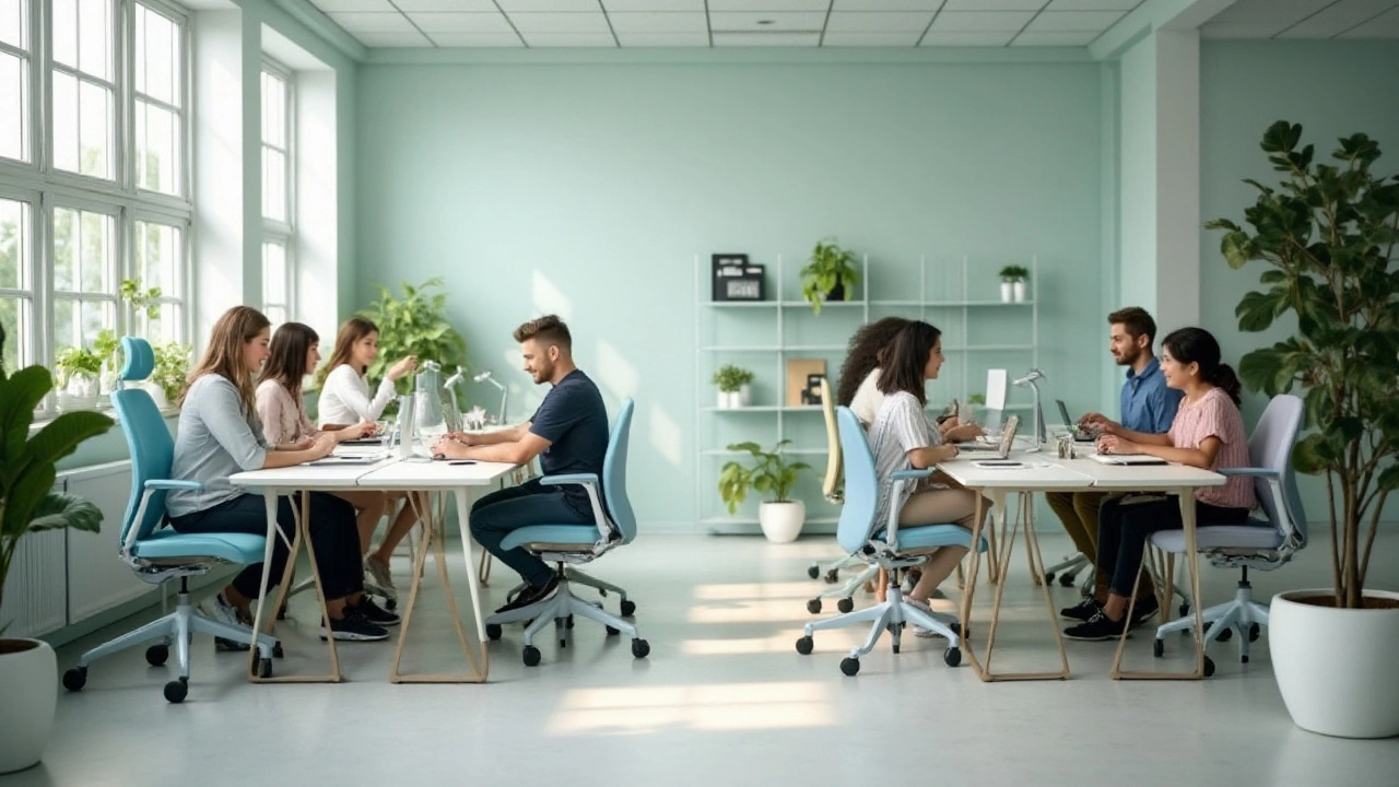
Discover how selecting the right color for office chairs can create a calming workspace for individuals with ADHD. Different hues impact concentration, mood, and productivity in unique ways. Explore which shades are known for their soothing effects, drawing on insights from color psychology. Utilize these tips to design an environment that enhances focus and appeases restlessness. Learn how to transform a chaotic space into a serene haven through thoughtful color choices.
More