Colour Psychology: Using Hues to Shape Mood and Style in Your Home
Ever walk into a room and feel instantly relaxed or suddenly energized? That’s colour psychology at work. The colors you choose for walls, sofas, cushions, and accessories can steer your mood without you even realizing it. In this guide we’ll break down the basics, show which shades suit each space, and give you quick tricks you can start using today.
Choosing the Right Colours for Different Rooms
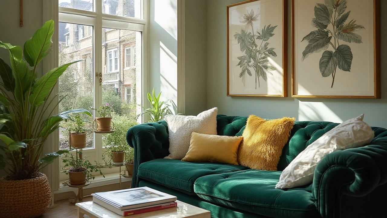
Living room: This is the social hub, so you want a balance of comfort and conversation. Soft blues and muted greens calm the mind, letting guests linger longer. Pair them with a warm neutral sofa – think light gray or beige – and add a splash of mustard or burnt orange in cushions for a friendly pop.
Bedroom: Your bedroom should feel like a reset button. Light lavender, pale pink, or a very soft gray helps lower stress and improve sleep quality. Keep bedding and curtains in those shades and avoid harsh reds or bright yellows, which can keep the brain wired.
Kitchen: This space fuels activity, so bright, energizing colours work well. Sunny yellow or fresh teal can lift spirits and make cooking feel less like a chore. If you prefer a subtler look, a warm white cabinet with teal drawer pulls gives a hint of colour without overwhelming the eye.
Home office: Focus is the goal here. Cool greens and gentle blues increase concentration, while a small amount of orange on a desk lamp or a single wall can spark creativity. Avoid too much red; it can raise anxiety levels when you’re trying to meet deadlines.
Practical Tips to Apply Colour Psychology
1. Start small. If you’re not ready for a full wall repaint, swap out cushions, throws, or a single piece of furniture. A navy armchair can add depth without changing the whole room’s vibe.
2. Use the 60‑30‑10 rule. Let 60% of the room be a dominant neutral, 30% a secondary colour that supports the mood you want, and 10% an accent tone for interest. This keeps the space balanced and prevents colour overload.
3. Test before you commit. Paint a 12‑inch square on the wall or hang a fabric swatch for a few days. Notice how the light changes the colour at morning, noon, and night. If it feels right at all three times, you’re good to go.
4. Mind the finish. Matte paints absorb light and feel calmer, while glossy finishes reflect and can make a colour feel more vibrant. Choose matte for relaxation zones and gloss for energizing spots.
5. Combine texture with colour. A rough linen cushion in a soft blue feels cozier than a smooth satin one. Mixing textures lets you play with the same hue in varied ways, adding depth without new colours.
6. Match colour with purpose. Our list of posts includes guides on durable sofas, furniture placement, and bedroom storage. When picking a sofa, think about the colour’s impact on the room’s function. A sturdy leather sofa in deep brown feels grounding for a family room, while a light fabric sectional in sage invites calm in a reading nook.
7. Don’t forget lighting. Natural light can make a soft pastel look bright, whereas artificial amber lighting can warm up cool tones. Use warm LED bulbs in spaces where you want extra coziness, like a living room with blues and greys.
By paying attention to how each hue affects your feelings, you can turn any room into a space that supports your daily life – whether you need focus, relaxation, or a burst of energy. Start with one change, notice the difference, and build from there. Your home can become a mood‑boosting sanctuary, one colour at a time.
Best Lounge Colours: Most Popular Choices and Expert Design Tips
Discover the most popular lounge colour right now, why it dominates, and pro tips for choosing your perfect shade. Make your living space stand out.
More