Neutral Furniture Colors – Timeless Shades for Any Home
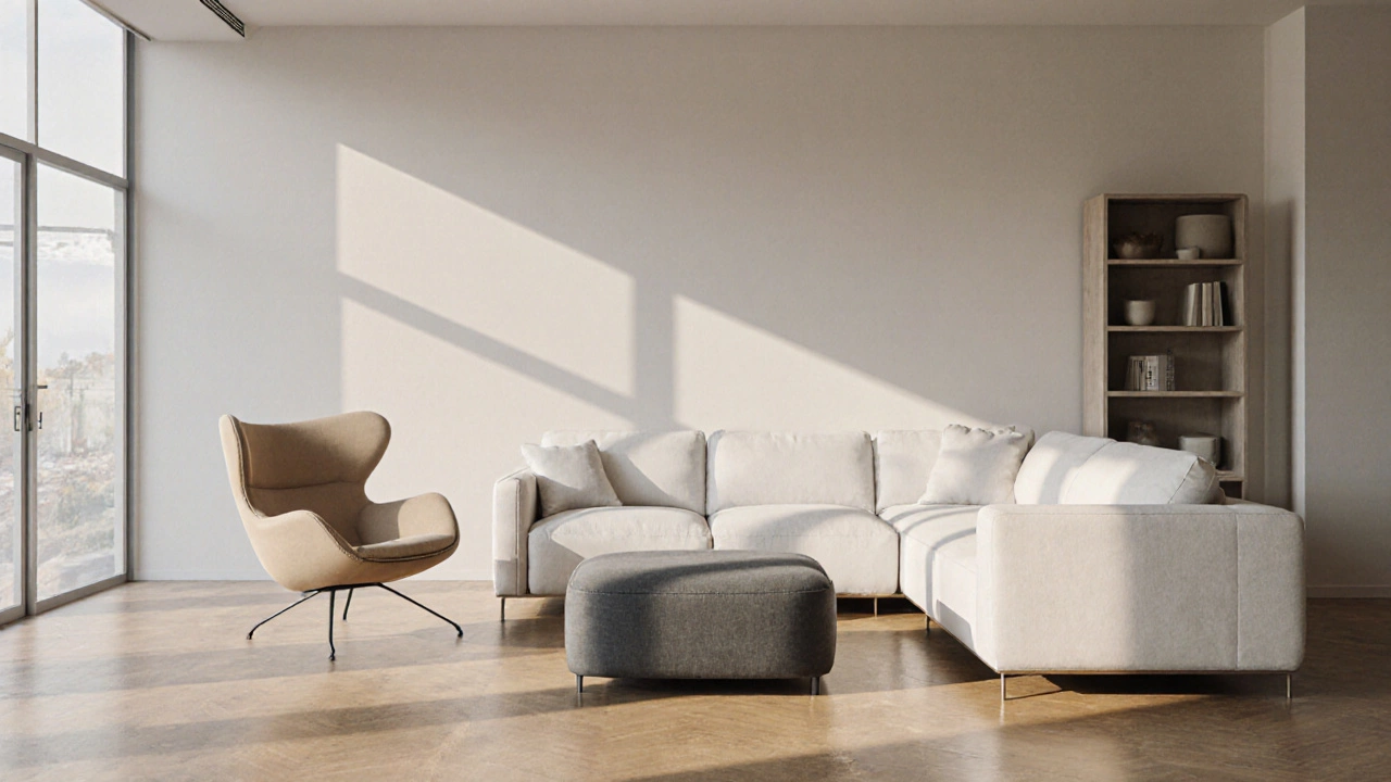
When planning neutral furniture colors, soft, understated hues like ivory, taupe, and greige that blend easily with most décor. Also known as neutral tones, they provide a flexible backdrop for personal style. Interior design relies on these shades to create balance, while a well‑chosen color palette guides accessory choices and lighting. Understanding home décor trends helps you pair neutrals with texture and pattern without overwhelming the space. Neutral furniture colors encompass timeless aesthetics, require a solid color palette, and are influenced by interior design principles.
One big advantage of neutrals is their ability to hide wear while still looking fresh. A light beige sofa, for example, masks everyday scuffs better than a bright jewel tone, letting you focus on cushions, throws, or a standout coffee table instead. When you combine a neutral base with natural wood accents, you get the rustic‑modern vibe that many UK homeowners crave. This blend works equally well in a cottage living room or a sleek city flat because the neutral foundation adapts to both rustic charm and contemporary sleekness.
Below you’ll find articles that break down everything from choosing the right shade for an office chair to pairing neutral furniture with bold wall art, selecting durable outdoor woods that keep their neutral look, and styling bookshelves so they complement a calm color scheme. These pieces give you actionable tips, maintenance tricks, and design ideas so you can make the most of neutral furniture colors in any room.
Best Neutral Furniture Colors That Match Any Décor
Discover the neutral furniture colors that match any décor, learn how to pick the right shade, and avoid common pitfalls for lasting style.
More