Interior Design Contrast Advisor
Your Room Profile
Imagine walking into a living room where the couch blends so seamlessly into the backdrop that you trip over it. It sounds dramatic, but lack of contrast in sofa color is a real design pitfall. Many homeowners hesitate here. You painted the walls a soft beige, should the fabric be tan? If the walls are charcoal, does the upholstery need to match? The truth lies somewhere between total blending and jarring clashing. Getting this balance right transforms a room from confusing to curated.
The decision isn't just about aesthetics; it dictates how spacious a room feels, how visible wear becomes, and even the mood of the space. This guide cuts through the noise to give you clear rules for pairing your seating with your surroundings.
The Golden Rule of Visual Weight
Before buying anything, understand the concept of visual weight. In Interior design uses contrast to define boundaries and create hierarchy within a space. When furniture matches wall paint exactly, the eye loses its anchor points. Without those anchors, ceilings feel lower and floor plans become ambiguous.
Generally, you want a difference in value. Value refers to how light or dark a color is, regardless of the hue. A navy blue sofa on white walls offers high contrast. That same navy on grey-blue walls loses definition. High contrast creates drama and makes the piece pop. Low contrast creates calm and continuity. Both have their place, but they serve different goals.
- High Contrast: Defines shape, adds energy, works well in large spaces.
- Low Contrast: Softens edges, makes rooms feel larger, good for minimalist styles.
- No Contrast: Risks the "floating object" effect where furniture disappears.
Most designers recommend at least three shades of difference between your sofa color and the background paint. If your wall is a light oatmeal, skip the taupe sofa. Go for charcoal, forest green, or even a crisp off-white to maintain separation. If the wall is deep, a lighter tone lifts the eye upward.
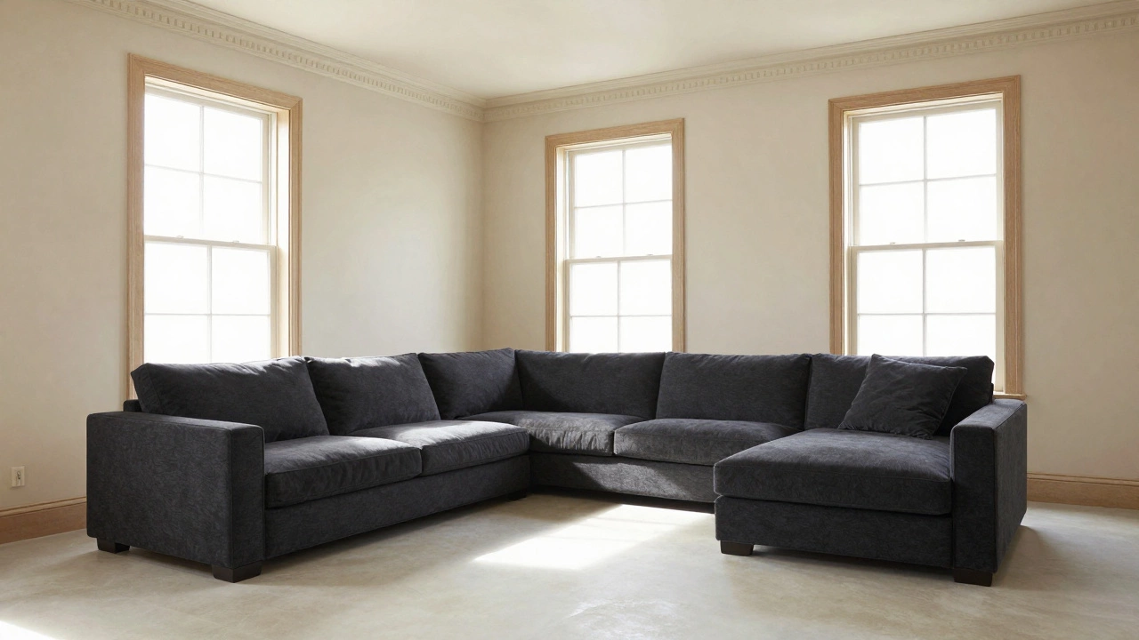
Scenario One: Light Walls and Dark Furniture
This is the safest bet for most homes. Painting walls white, cream, or pale gray allows you maximum flexibility when choosing upholstery. A dark sofa acts as an anchor in a bright room. Think of it like a gallery frame around a painting. The bright walls reflect natural light, making the space feel airy, while the heavy furniture grounds the area.
Why does this work? Light surfaces bounce illumination around the room. If you fill that reflection-heavy environment with more light objects, the room can feel washed out or sterile. A dark sectional in charcoal or chocolate introduces warmth. It absorbs some light, creating depth that our eyes perceive as sophistication. This setup is particularly useful in rooms with North-facing windows. These rooms receive cooler, bluer light. A dark brown or warm black leather counters that chilliness perfectly.
You also gain longevity with this approach. If you decide to repaint the walls five years from now, the dark sofa will still look great against almost any neutral shade. It becomes a constant in a changing environment.
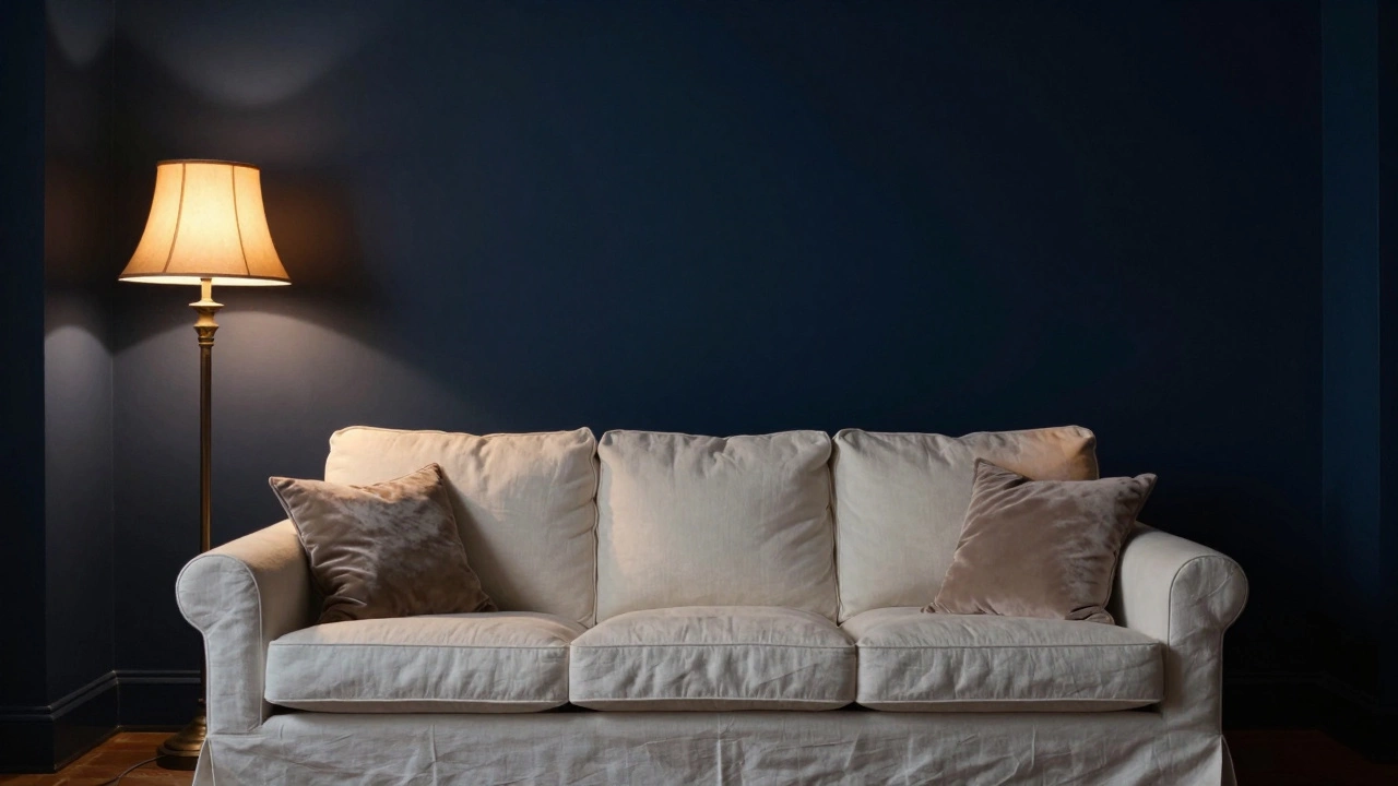
Scenario Two: Dark Walls and Light Furniture
Moving to deeper hues requires more confidence. Black or navy walls demand attention. Pairing them with another dark element often results in a cave-like atmosphere. Conversely, placing a light-colored sofa against a dark wall creates striking drama. The light fabric reflects what little light reaches the center of the room, preventing the furniture from disappearing into the shadows.
This combination leans modern and moody. It works exceptionally well in family rooms or dens where you might leave lights on after dusk. Just ensure you have adequate task lighting. Without lamps or overhead fixtures, a dark room with light furniture can lose visibility. Consider velvet textures here. They catch light differently than matte cottons, adding a sheen that bridges the gap between the two tones.
A potential downside involves maintenance. On a dark wall, dust on a light sofa is less noticeable than dirt showing on a dark sofa. However, light fabrics stain more easily. You must weigh the aesthetic benefit against your household habits. If you have kids or pets, a medium-tone performance fabric often sits in the sweet spot between these extremes.
The Risk of Monochromatic Matching
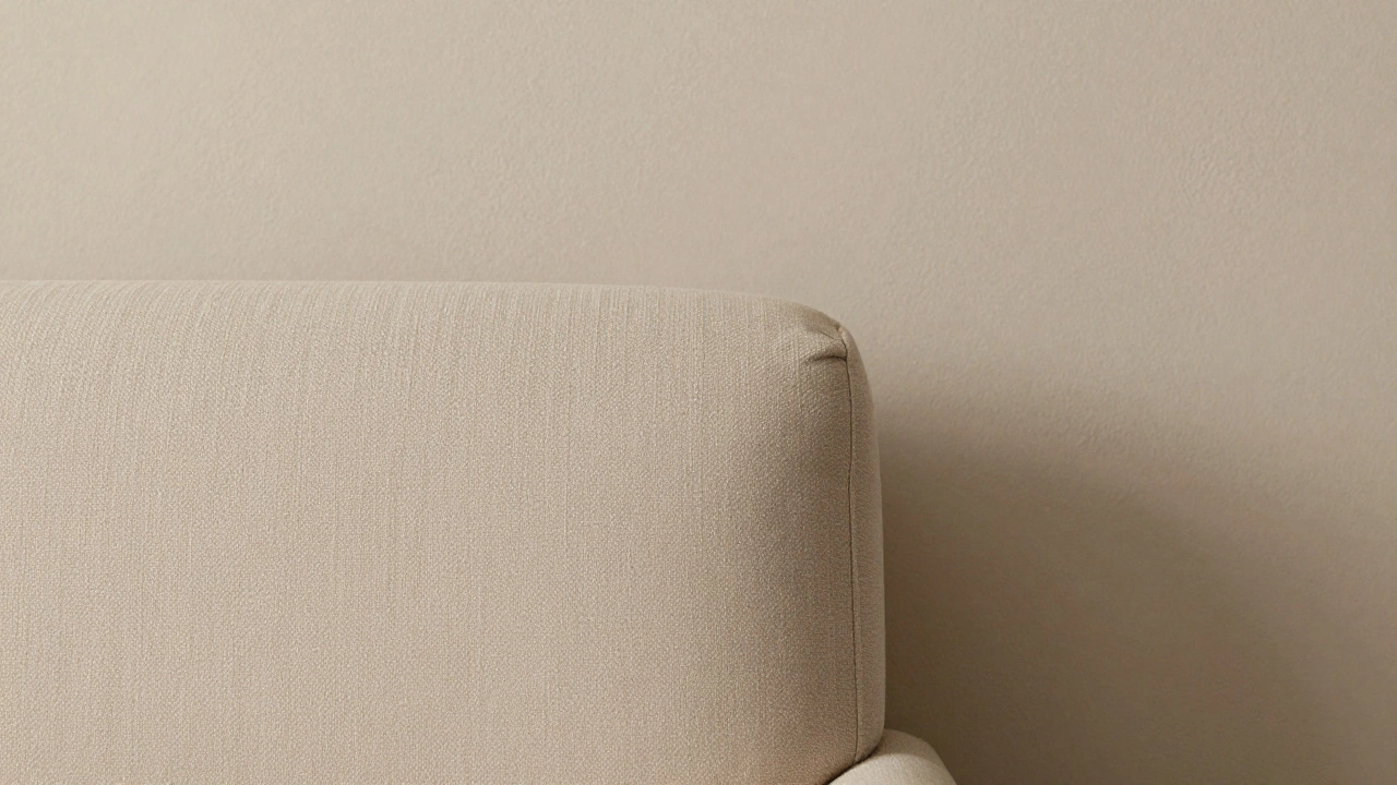
Sometimes you see photos of beige sofas against beige walls and think it looks beautiful. In reality, this monochromatic style relies entirely on texture. If both surfaces look flat, the design fails. Imagine a linen wall next to a flat-weave linen chair. The boundary vanishes.
To make this work, you need distinct material properties. Perhaps the walls have a textured plaster finish while the sofa is smooth bouclé. Or maybe the wall is matte paint and the sofa is glossy leather. The eye reads these differences as separate planes. If you lack the skill to mix textures confidently, sticking to a contrasting color palette is safer.
Another factor is architectural details. Crown molding, baseboards, and door frames create lines. If your sofa color matches the trim rather than the wall, you extend the vertical line. This tricks the brain into perceiving higher ceilings. Match the wood tone of your trim, not necessarily the wall paint itself.
How Lighting Changes the Equation
Natural sunlight changes the perceived value of colors throughout the day. A swatch that looks perfect under store fluorescent lights might appear muddy in your afternoon sun. Always test your wall color samples alongside your fabric swatches at home.
| Strategy | Best For | Risks |
|---|---|---|
| Dark Sofa / Light Walls | North facing rooms, Traditional decor | Can feel formal |
| Light Sofa / Dark Walls | South facing rooms, Modern minimalism | Requires good lighting |
| Matching Hues | Calm bedrooms, Meditation spaces | Loss of spatial definition |
| Complementary Colors | Playrooms, Bold statement areas | Dated quickly if not classic |
Artificial light plays a role too. Incandescent bulbs cast a yellow glow that warms cool greys. LED daylight bulbs can make warm neutrals look greenish. Before committing to a purchase, evaluate your primary light source. If you spend most evenings in artificial light, prioritize how the colors look under those bulbs rather than midday sun.
Fabric Texture and Pattern Considerations
Color isn't the only variable. Patterns break up solid blocks of color. A floral print sofa on solid green walls offers thousands of tonal variations. Even if the dominant pattern color matches the wall, the secondary colors provide contrast. Solids tend to show dirt more readily than busy weaves.
Texture adds hidden dimension. A chunky knit throw pillow on a sleek leather sofa creates immediate interest. Layering textures can replace the need for high color contrast. For instance, a grey wool rug with a grey suede sofa works because the grain differs enough to tell the eye these are distinct layers. Without texture variation, the space flattens visually.
FAQ Page
Can I have a black sofa in a small room?
Yes, but pair it with very light walls. A black sofa absorbs light, which helps it recede visually if surrounded by brightness. Avoid pairing dark furniture with dark floors in small boxes, as that reduces the sense of volume.
Is it better to match the wall color or the wood trim?
Match the wall color usually. Trim provides a border. If your sofa clashes with the wall but matches the trim, you create visual confusion. Consistency with the largest surface area (the wall) stabilizes the room.
What if I want to change wall colors later?
Choose a neutral sofa color that sits in the middle of the spectrum. Greige or navy blue works with almost every paint trend. It gives you freedom to experiment with seasonal wall updates without replacing furniture.
Write a comment