
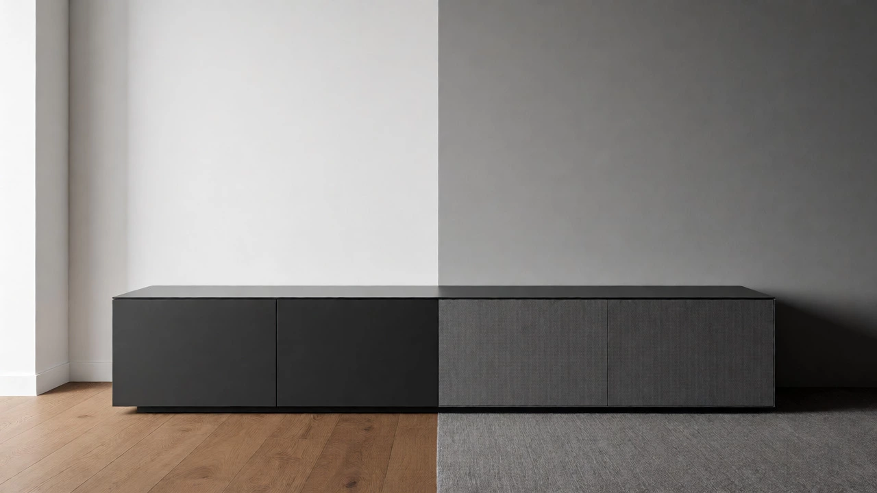
TV Stand Color Matcher
Select your current wall and floor colors to see recommended TV stand colors and a visual preview.
1. Choose Your Room Elements
2. Visual Preview
Recommended TV Stand Colors
You just bought that sleek 65-inch OLED, and now you're staring at an empty spot in your living room. The TV is the star, sure, but the TV stand is the stage it performs on. Pick the wrong color, and your expensive screen looks like it was dropped there by accident. Pick the right one, and suddenly your whole room feels intentional.
There isn't one magic color that works everywhere. If someone tells you "black always wins," they haven't seen a black TV stand disappear into a dark wall or clash with warm oak floors. The best color depends entirely on three things: your wall color, your flooring, and what you want the eye to focus on. Let's break down how to make that choice without second-guessing yourself every time you walk past the sofa.
The Rule of Contrast vs. Blending
Designers usually talk about two strategies: contrast and blending. Neither is "correct." They just create different vibes.
Contrast makes the TV stand pop. Think white walls with a charcoal gray stand, or light beige carpets with a dark walnut unit. This draws attention to the furniture piece itself. It’s bold, modern, and great if your stand has interesting legs or open shelving you want to show off. But be careful-high contrast can fragment a small room visually, making it feel busier than it is.
Blending lets the TV stand recede. A medium-gray stand against a gray textured wall, or a natural wood tone near wooden floorboards, creates a seamless look. This is ideal for minimalist spaces or rooms where you don’t want the furniture competing with artwork or windows. The risk? If the tones are too similar but not identical, it can look muddy or mismatched rather than intentional.
Here’s a quick heuristic: If your walls are busy (patterned wallpaper, brick, or multiple colors), go for a simple, blended stand. If your walls are plain, you have more freedom to play with contrast.
Matching Your Flooring: The Anchor Point
Your floor is the largest visual surface in the room. Ignoring it when picking a stand color is a common mistake. You don’t need to match your stand exactly to your floor-that often looks dated-but you should harmonize with it.
If you have hardwood floors, consider the undertone. Warm woods (oak, cherry) pair beautifully with warm neutrals like taupe, cream, or rich browns. Cool woods (maple, ash, gray-washed pine) look sharper with cool grays, whites, or black. Mixing warm and cool tones isn’t forbidden, but it requires a bridge element-like a rug or metal accents-to tie them together.
For carpeted rooms, especially with neutral beige or gray carpet, you have more flexibility. Darker stands ground the space. Light-colored stands can feel airy but might get lost if the carpet is also light. In these cases, adding texture (matte vs. glossy finish) helps distinguish the stand from the floor.
Tile or concrete floors tend to be cooler and harder. Softening them with a wood-toned stand adds warmth. A black metal stand can work in industrial lofts, but in a cozy home, it might feel too cold unless balanced with soft textiles nearby.
Wall Color Dictates the Mood
Let’s get specific about paint colors because this is where most people hesitate.
White Walls: The blank canvas. Almost any color works here, but context matters. A pure white stand on white walls can vanish, which is fine if you want minimalism. A black stand creates a striking, graphic frame. Wood tones add instant warmth to a stark white room. If you’re renting and can’t change the walls, a mid-tone gray stand is the safest bet-it won’t clash with future wall colors if you ever repaint.
Gray Walls: Popular, but tricky. Cool grays (blue-based) pair well with black, white, or cool wood tones. Warm grays (taupe-based) love warmer woods or creamy whites. Avoid placing a yellow-based wood stand next to a blue-gray wall; the clash in undertones will bother you more than you expect.
Beige or Cream Walls: These warm neutrals scream for warmth. Natural wood, espresso brown, or terracotta-hued stands look fantastic. Pure white can sometimes look clinical against cream, so opt for off-white or ivory instead. Black provides strong contrast but can feel harsh if not softened with plants or art.
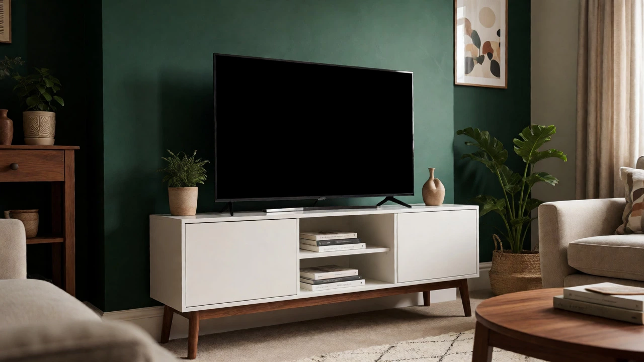
Dark Walls (Navy, Charcoal, Forest Green): Here, lighter stands shine. White, light gray, or pale wood creates necessary contrast so the TV doesn’t blend into the background. Dark-on-dark schemes can work in very large, well-lit rooms, but they require excellent lighting to avoid looking like a cave.
The Role of Finish: Matte vs. Glossy
Color isn’t just hue; it’s also how light hits the surface. This affects perceived size and cleanliness.
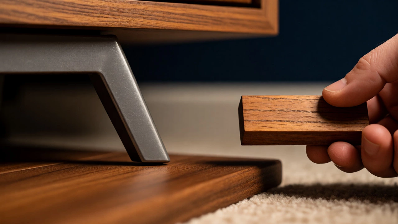
Matte finishes absorb light. They hide fingerprints, dust, and scratches better than glossy ones. A matte black stand looks sophisticated and modern. Matte wood grains look authentic and tactile. This is the practical choice for households with kids or pets.
Glossy finishes reflect light. They make small rooms feel larger and brighter. A high-gloss white stand can bounce sunlight around a dim corner. However, gloss highlights imperfections. Every smudge shows up. Also, glare from the TV screen can be annoying if the stand is directly below and highly reflective.
A good middle ground is satin or semi-gloss. You get some sheen without the fingerprint magnet status of high gloss.
Trending Colors for 2026: What’s Actually Working
Furniture trends move slower than fashion, but shifts happen. Right now, we’re seeing a move away from ultra-modern all-black setups toward warmer, organic palettes.
- Natural Oak & Ash: Still dominant. Light woods bring Scandinavian calm. They work with almost everything and never feel heavy.
- Warm Gray (Greige): The successor to cool gray. It’s softer, less sterile, and pairs easily with both warm and cool accessories.
- Deep Earth Tones: Terracotta, olive green, and deep teal are emerging as statement pieces. These aren’t for everyone, but if you want personality, a muted green stand can anchor a room without shouting.
- Two-Tone Designs: Combining materials is huge. Think a white cabinet body with walnut legs, or a black frame with light wood shelves. This solves the matching problem by letting you connect with two different elements in the room (e.g., matching the walls with the white part and the floor with the wood part).
Notice what’s fading? High-gloss reds, oranges, and overly ornate gold trims. Unless you’re going full eclectic vintage, stick to cleaner lines and natural hues.
Practical Checklist Before You Buy
Don’t buy online based on a tiny thumbnail photo. Screen colors lie. Follow these steps to ensure you won’t hate it after delivery.
- Get Samples: Most retailers offer fabric or wood samples for under $10. Order three options. Tape them to your wall next to your floor edge. Look at them in morning light, afternoon sun, and evening lamp light. Colors shift dramatically.
- Check the TV Bezel: Is your TV bezel black, silver, or brushed metal? A black bezel blends seamlessly with a black stand. A silver bezel might look odd on a dark wood stand unless you have other silver accents (lamp bases, frames) in the room.
- Consider the Room Size: Small room? Lighter colors expand space. Large room? Darker colors can define zones and prevent the space from feeling cavernous.
- Think About Maintenance: White shows dirt and pet hair instantly. Black shows dust and lint. Medium tones (gray, brown, tan) are the low-maintenance champions.
| Room Element | Recommended Stand Color | Why It Works | Risk to Avoid |
|---|---|---|---|
| White Walls + Wood Floor | Light Oak or Walnut | Adds warmth, bridges floor and wall | Pure white stand may look clinical |
| Gray Walls + Carpet | Charcoal or Medium Gray | Monochromatic harmony, modern look | Too similar tone looks muddy |
| Beige Walls + Tile | Espresso or Dark Brown | Grounds the light space, adds depth | Black may feel too harsh/cold |
| Dark Blue/Green Walls | Crisp White or Pale Wood | High contrast, prevents gloominess | Dark stand disappears into wall |
| Industrial Loft (Concrete) | Black Metal or Reclaimed Wood | Matches aesthetic, durable | Glossy white looks out of place |
Mistakes That Ruin the Look
Even with the right color, execution fails sometimes. Here are the usual suspects.
Ignoring Scale: A massive dark stand in a tiny apartment overwhelms the room. A delicate white stand in a large hall gets lost. Color perception changes with size. Dark colors shrink objects visually; light colors expand them. Use this to your advantage.
Clashing Undertones: This is subtle but powerful. If your floor has pinkish undertones (common in older cherry woods) and you pick a stand with yellow undertones (pine), they’ll fight each other. Always check undertones. Hold the sample against your floor in daylight.
Forgetting Lighting: A dark stand in a north-facing room with little natural light can turn nearly black and look depressing. If your room is dim, lean toward lighter finishes or add strategic lighting behind the stand.
Buying for Trends, Not Longevity: That bright teal stand might be hot now, but do you want to replace it in two years? Neutral colors have staying power. If you crave color, use it in smaller, swappable items like cushions or rugs, keeping the big furniture investment flexible.
Final Verdict: Which Color Should You Pick?
If you’re paralyzed by choice, here’s the safe harbor answer: Medium-tone wood or warm gray.
Why? Because they adapt. A walnut stand looks good with white, beige, gray, and even navy walls. It hides dust better than black and doesn’t show stains like white. It brings warmth without being loud. It’s the Swiss Army knife of TV stands.
But if you want character, go bold. A black stand in a bright, white-minimalist room is chic. A white stand in a cozy, dark-walled den is dramatic. Trust your eyes over rules. If it feels right when you look at the sample in your actual space, buy it.
Remember, the TV stand supports more than just electronics. It holds books, games, memories, and daily clutter. Choose a color that makes you happy to look at it every day, not just one that photographs well for Instagram.
Does a TV stand need to match my coffee table?
No, and often it shouldn't. Matching sets can look dated and rigid. Instead, aim for coordination. If your coffee table is dark walnut, your TV stand could be a lighter oak or even a contrasting black metal, provided they share a similar style era (e.g., both mid-century modern). Variation creates interest; exact matching creates monotony.
Is black or white better for a TV stand?
It depends on your room's brightness and maintenance tolerance. Black is sleek and modern but shows dust and pet hair clearly. White is airy and makes small rooms feel bigger but shows dirt and scuffs easily. If you have young kids or pets, a medium gray or wood tone is usually more practical than either extreme.
Can I mix wood tones in my living room?
Yes, absolutely. The key is to vary the shade significantly enough that it looks intentional, not accidental. For example, pair a light oak TV stand with a dark walnut coffee table. Or mix wood with other materials like metal or glass. Just try to keep the undertones consistent (all warm or all cool) to maintain harmony.
What color TV stand goes with gray walls?
First, determine if your gray is warm (beige-based) or cool (blue-based). Warm grays pair well with creams, taupes, and warm woods like cherry or mahogany. Cool grats look sharp with blacks, whites, and cool woods like maple or ash. If unsure, a medium gray stand creates a monochromatic, sophisticated look.
Should the TV stand be darker or lighter than the floor?
There's no strict rule, but generally, having some contrast helps define the space. If your floor is light, a darker stand grounds the area. If your floor is dark, a lighter stand prevents the room from feeling heavy. If they are similar shades, ensure the textures differ (e.g., matte stand vs. glossy floor) to avoid a flat appearance.
Write a comment