
Elegant Room Palette Simulator
Select a classic elegant palette below to see how wall colors, sofa tones, and metallic accents work together to create sophistication.
The Modern Minimalist
Relies on high contrast between light and dark elements. It feels crisp and intentional.
You walk into a hotel lobby or a high-end friend’s living room and immediately feel a shift in the air. It is not just about expensive furniture; it is about the mood. You might think elegance requires gold leaf and velvet drapes, but often, it is simply about color choice. The right hue can make a small apartment feel like a grand estate, while the wrong one can make a spacious loft feel cramped and cheap.
So, what actually creates that sense of sophistication? Is it white? Is it black? Or something more nuanced? As someone who has spent years arranging sofa sets in everything from drafty Victorian conversions in Birmingham to modern city apartments, I can tell you there is no single magic color. However, there are specific strategies that consistently deliver an elegant result. Let’s break down exactly which colors work, why they work, and how to use them without turning your home into a showroom nobody wants to sit in.
The Myth of "Elegant" White
For decades, white was the default answer for elegance. It screams cleanliness and space. But here is the problem: pure, bright white often feels clinical. It reflects too much light, creating glare that hurts the eyes rather than soothing them. If you want true elegance, you need to ditch the hospital-grade white for warm neutrals.
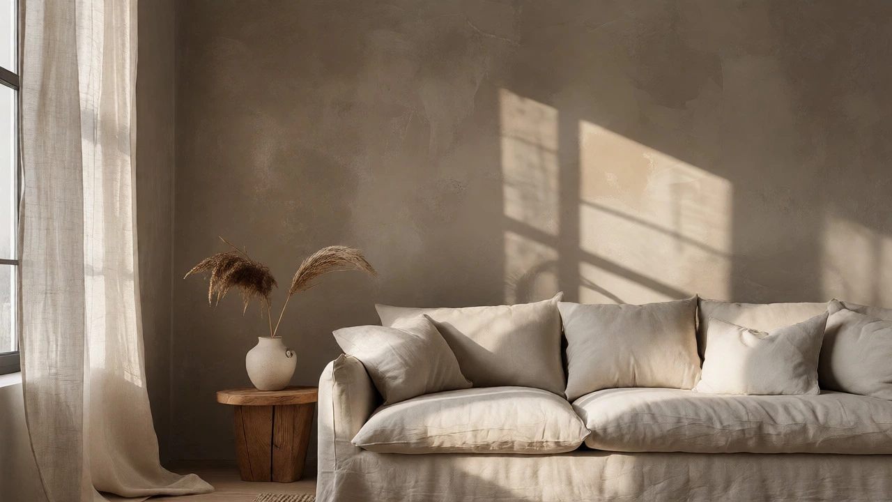
Think about shades like cream, ivory, beige, and taupe. These colors have depth. They absorb some light rather than bouncing it all back at you, which creates a softer, more inviting atmosphere. In my experience working with clients, swapping a stark white wall for a warm off-white instantly makes a room feel more expensive. Why? Because it mimics natural materials like stone, linen, and plaster. It feels organic, not manufactured.
If you are sticking with neutrals, avoid cool grays unless you have perfect lighting. Cool grays can look flat and depressing on overcast days, which is most days here in the UK. Warm grays, greiges (gray-beige hybrids), and soft taupes are far safer bets for lasting elegance.
Dark and Moody: The Power of Depth
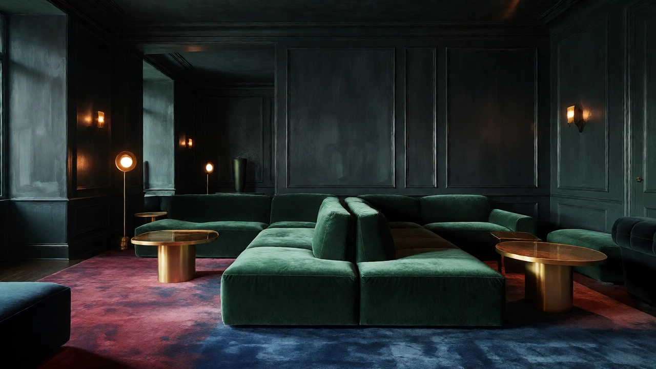
Here is a controversial take: dark colors are often more elegant than light ones. We tend to fear darkness because we associate it with smallness. But in reality, dark walls blur the boundaries of a room. When you paint a room in deep navy, charcoal, or forest green, the corners disappear. The eye doesn’t know where the wall ends and the ceiling begins, which actually makes the space feel larger and more mysterious.
Deep jewel tones are particularly effective. Emerald green, sapphire blue, and burgundy evoke richness. Historically, these dyes were expensive to produce, so our brains still associate them with wealth and status. Using a dark color on walls, or even just on the lower half of the wall (wainscoting style), adds instant drama.
But you don’t have to paint the whole room black. Consider using dark colors on large furniture pieces instead. A deep charcoal or navy sectional sofa acts as an anchor. It grounds the room and provides a strong contrast against lighter rugs or curtains. This technique works wonders for open-plan living areas where you need to define zones without building walls.
The Role of Texture in Elegance
Color alone cannot create elegance. If you paint a room beige and fill it with plastic furniture, it will look cheap. Elegance lives in texture. This is especially true when choosing upholstery for your seating area.
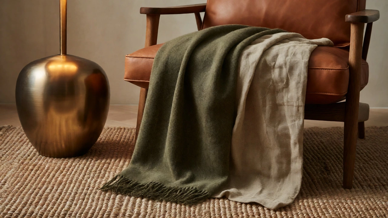
When selecting fabrics for your Sofa Set, a collection of matching upholstered seats designed to create a cohesive seating arrangement in a living space, prioritize natural fibers. Velvet catches light in a way that looks lush and expensive. Linen wrinkles, but that imperfection signals authenticity and comfort. Wool blends offer durability and a matte finish that absorbs light softly.
Avoid shiny synthetics that reflect harsh overhead lights. Instead, mix textures within the same color family. Imagine a room painted in a soft dove gray. Add a wool rug, a velvet cushion, and a leather side table. Even though the color palette is monochromatic, the varying textures create visual interest. This layering prevents the room from feeling flat or boring.
Classic Combinations That Never Fail
If you are unsure where to start, stick to proven pairings. Some combinations have stood the test of time because they balance contrast and harmony perfectly. Here are three foolproof palettes for an elegant look:
| Palette Name | Primary Color | Secondary Color | Accent Material | Best For |
|---|---|---|---|---|
| The Modern Minimalist | Warm White / Cream | Charcoal Gray | Brushed Brass | Small apartments, modern lofts |
| The Traditional Luxe | Navy Blue | Cream / Beige | Polished Gold | Formal living rooms, studies |
| The Earthy Organic | Olive Green | Terracotta | Raw Wood | Relaxed lounges, sunrooms |
The "Modern Minimalist" palette relies on high contrast between light and dark elements. It feels crisp and intentional. The "Traditional Luxe" option uses navy as a grounding force, allowing cream sofas to pop. Navy is surprisingly versatile-it pairs well with wood tones, metallics, and pastels. The "Earthy Organic" scheme brings nature indoors. Olive green is calming yet rich, and when paired with terracotta pots or rugs, it feels warm and lived-in.
Metallic Accents: The Jewelry of the Room
You wouldn’t wear a plain dress to a gala without jewelry, right? Your room needs accessories too. Metallic accents elevate a color scheme by adding sparkle and reflection. But choose wisely.
Gold and brass bring warmth. They look stunning against dark blues, greens, and blacks. Silver and chrome feel cooler and more industrial. Use them with grays, whites, and cool blues. Copper sits somewhere in the middle, offering a reddish warmth that pairs beautifully with earthy tones like rust, mustard, and olive.
Don’t overdo it. Too many shiny surfaces can look tacky. Pick one dominant metal tone and stick to it throughout the room. If your lamp bases are brass, your coffee table legs should probably be brass too. Consistency signals intentionality, and intentionality reads as elegance.
Lighting Changes Everything
You can pick the perfect paint chip, but if your lighting is bad, the color will fail. Most people rely on a single overhead light, which flattens colors and casts unflattering shadows. To see your colors in their best light, you need layers.
Use floor lamps and table lamps with warm bulbs (around 2700K-3000K). Place them at different heights to cast pools of light across the room. This highlights the texture of your sofa fabric and the depth of your wall color. During the day, ensure your window treatments allow natural light to filter through gently. Heavy blackout curtains block the very light that makes colors sing. Sheer linen curtains are the secret weapon of designers-they diffuse sunlight, reducing glare while maintaining brightness.
Pitfalls to Avoid
Elegance is fragile. One mistake can ruin the vibe. Here are common traps to dodge:
- Overusing Bright Primary Colors: Red, yellow, and blue in their purest forms feel childish. Muted versions-like burgundy, mustard, and slate blue-are sophisticated.
- Ignoring Undertones: Not all grays are alike. A gray with purple undertones clashes with beige. Always test paint samples in your actual room light before committing.
- Lack of Contrast: A room entirely in one shade can feel sleepy. Introduce contrast through pillows, art, or rugs to keep the eye engaged.
- Clutter: No amount of beautiful color can hide mess. Elegance requires breathing room. Keep surfaces clear and let the architecture and furniture speak.
Final Thoughts on Choosing Your Palette
There is no objective "best" color for elegance. It depends on your lifestyle, your architecture, and your personal taste. But if you want a safe starting point, begin with warm neutrals. Build depth with darker furniture pieces. Add life with textured fabrics. Finish with metallic accents.
Remember, elegance isn’t about perfection. It’s about cohesion. When every element in the room-from the wall paint to the throw pillow-feels like it belongs together, you achieve that effortless, high-end look. Start small. Change one thing, like your sofa cushions or a feature wall, and see how it shifts the mood. You might be surprised at how little it takes to transform your space.
Does white always make a room look bigger?
While white reflects light and can make a room feel airy, it doesn't always make it look "bigger" in an elegant sense. Pure white can sometimes highlight awkward architectural features or feel cold. Warm off-whites and creams often provide a better balance of light reflection and cozy depth, making the space feel expansive yet inviting.
Is black considered an elegant color for walls?
Yes, black is highly elegant, but it requires careful execution. Black walls blur the boundaries of a room, creating a dramatic, intimate atmosphere. It works best in spaces with good lighting and contrasting furniture (like white or light wood) to prevent the room from feeling cave-like. Matte finishes are preferred over gloss to reduce glare.
How do I choose the right accent color for my sofa set?
Look at the undertones of your existing room. If your walls are warm (beige, cream), choose warm accents like rust, gold, or olive. If your walls are cool (gray, blue), opt for cool accents like teal, silver, or lavender. Stick to one or two accent colors to maintain a cohesive, sophisticated look rather than mixing too many hues.
Can small rooms handle dark elegant colors?
Absolutely. Dark colors recede visually, meaning they make walls appear further away than they are. A small room painted in deep navy or charcoal can feel larger and more luxurious than a small room painted in a bright, busy pattern. Just ensure you have adequate artificial lighting to compensate for the lack of light absorption.
What is the most timeless color for a living room?
Navy blue is widely considered one of the most timeless colors for living rooms. It pairs effortlessly with almost any other color, from traditional reds and greens to modern grays and yellows. It conveys stability and calm without being as severe as black or as sterile as white, making it a perennial favorite for elegant interiors.
Write a comment